Devlog 16 - Level Graphics Experiments
Published: October 29nd, 2021
I didn't get a ton done this week, but the work I did get around to was mostly focused around revamping the level graphics, which is a still-ongoing task that I'm trying to tackle. This'll probably be a shorter post as I don't have a lot to show yet.
Palette Shader Note
Before I get into it, a few minor follow-up notes on last week's palette shader article. First, I realized that I had done the 0.5 pixel correction in the y (v) direction, but not the x (u) direction, so that needed to be added.
Secondly, I talked about how I was able to use bilinear filtering to transition between different palettes. That's working just fine for the levels, which go through a sequential series of palettes, but for the menu screen, I actually need to handle multiple different palette transitions depending on which menu you drill down into, so instead of relying on texture filtering I needed to actually blend between two different palette textures there. Just thought I'd mention it for completeness.
Spikes and Spike Walls
Part of the work I did this week was to consolidate all of the graphics for each world into a single spritesheet image as opposed to saving them as individual png files. I'm...not actually sure why I didn't do this in the first place, but it makes it much easier to edit the graphics for a world all at once rather than having to open a bunch of different individual files (and having to edit the palette of each one...). This also lets me create a sort of "template" spritesheet layout for each world, which hopefully will reduce the amount of boilerplate work.
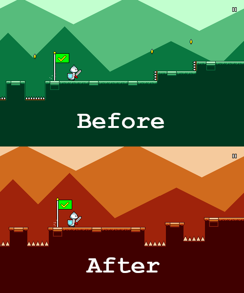
As I was doing this I decided to make the spike graphics larger:
I honestly can't remember why the spikes were so small to begin with, but it may have had something to do with the fact that everything used to be tile-based and thus needed to line up nicely with a 20-pixel grid (?). That's no longer really an issue and I've worked it out so that the spikes can just be clipped off by the edges of jumps, it looks fine.
You'll also note that the vertical "spike walls" have been converted to normal spike pit jumps. The spike walls were something that were sort of a legacy carry-over; they're functionally equivalent to a normal jump, and they were only ever used in like one or two levels (and then I sort of forgot about them for the rest of the game). They're intuitive and present a kind of a fun sort of variety, but ultimately they seem unnecessary, so I'm cutting them for now in favor of simplicity and elegance.
You might also notice that the coins are gone. I talked about trying this out in an earlier post. The jury is still out on this one -- I sort of have to try it out in action to see how it feels to have them missing.
Palettes
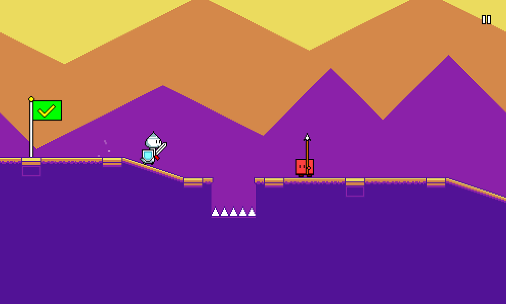
Part of the whole goal of having the palette shader was to be able to do more interesting things with the color palettes for the levels. Here's an extreme example of a sort of synthwave/outrun-ish color scheme:
Something I really wanted to try was using palettes with more than four colors, to see if that would help the levels look better. Here's a rough attempt at that that I came up with:
It's certainly more...colorful than the monochromatic color themes (d'uh). But in my opinion there's a certain loss of cohesion in the image. The foreground characters also stand out a little less from the background since everything is a little more saturated. Of course, you could argue that this is due to me not choosing a nice palette, but I think that's sort of my point exactly -- sticking to the simplicity of the four-color palette makes it simpler for me to author a pleasing color scheme.
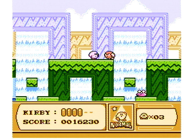
Much of the strength of chiptune music and pixel art arguably lies in adhering to restrictions that enforce a uniform style. I'm sure that if I was a more talented artist, I could come up with artwork that takes advantage of more than four colors. You know, something like this:
But part of being a solo gamedev is playing to your strengths. That said, I think this experimentation was still worthwhile, and I'll probably still keep the foreground and background elements as using different sets of four colors (possibly only during certain sections of the song?). But limiting each individual part of the level to four colors seems to work well. Fortunately, even if I decide to later break this rule, my palette shader is flexible enough that it should support that just fine.
Grass
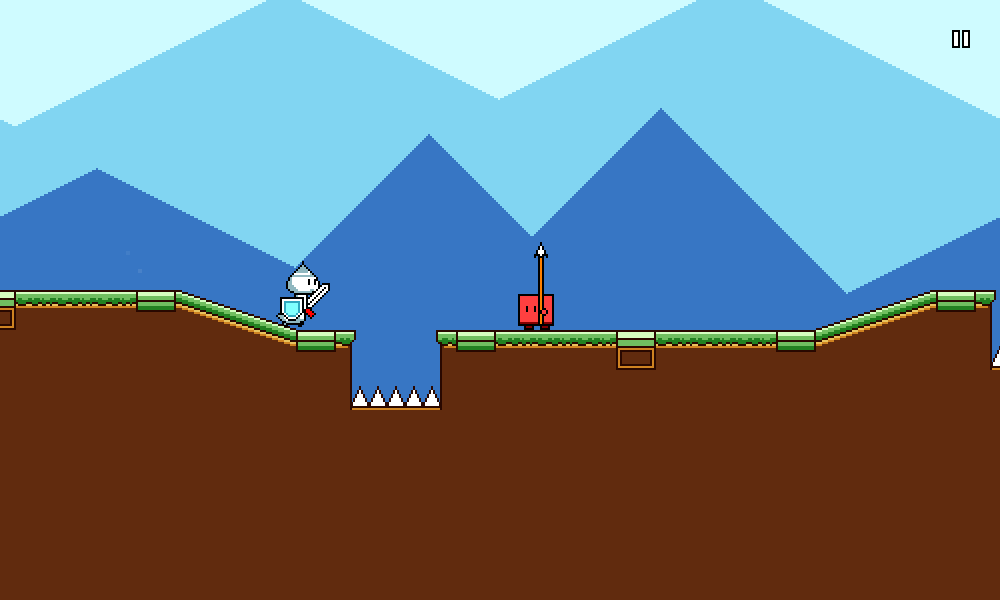
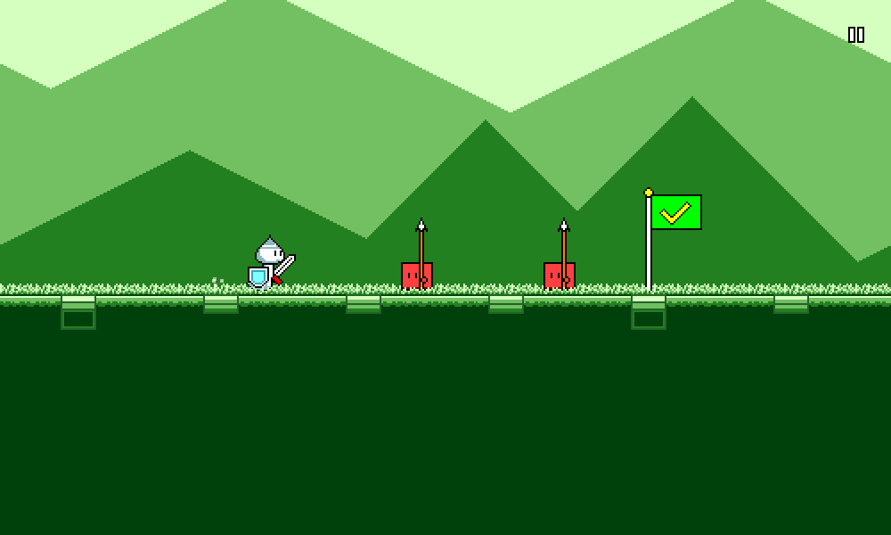
I figured that grass might be interesting to try out for the first level(s) (sticking to the generic "first level = grass level" videogame trope), so here's my attempt at that:
It's a bit noisy, but overall I don't hate it. I've added two different layers of grass -- one behind the characters and one in front of them, which sort of gives it a subtle (barely noticable) feeling of depth. Unfortunately, drawing grass like this on sloped surfaces is kind of a pain in the butt to get right, so that's something I still need to work on for next week. Each world will probably end up having unique graphical stylings like this, so I'll have to play around with it as I go through them.
Particles
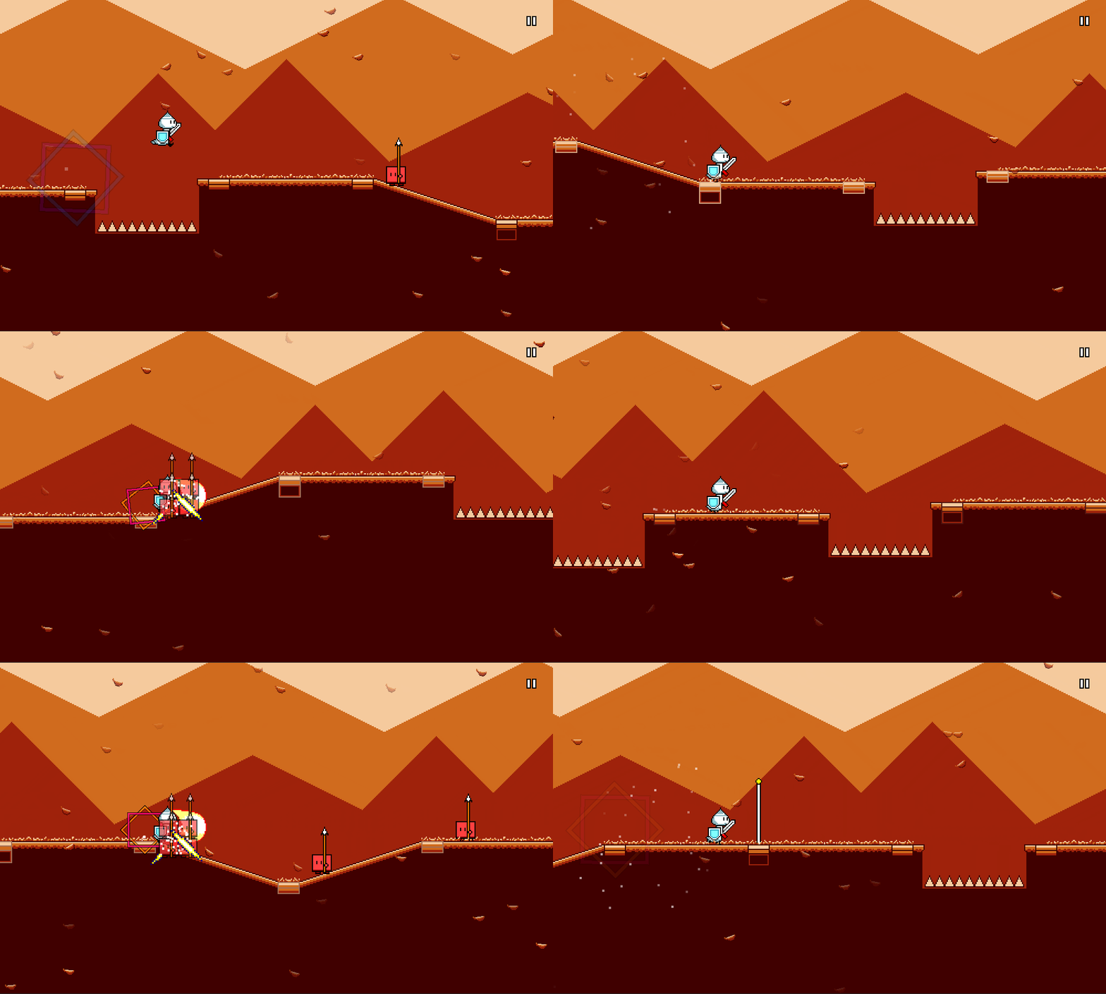
This was an obvious one that I wanted to try, as particles tend to be a nice way to add some additional motion to scenes to make them feel less static. Still needs more iteration, and these will probably end up being different per world, but here's the first stab at it with a generic leaf sprite:
It already looks pretty nice! Funnily enough, I actually just copied the leaf sprite over from my previous game Melody Muncher, and the idea of using particle effects to accentuate the high points of the song is probably going to be reused as well. Hooray for building up upon previous work!
That's it for this week! A lot of this work was more on the experimental side, and I wasn't sure at the beginning what would end up working or not, but I think I've got a better idea of where to go from here now. Sometimes you definitely run into these sort of phases where you just need to go through and try some different things, even if it results in some amount of wasted work.
<< Back: Devlog 15 - Palette Shaders
>> Next: Devlog 17 - Coin Collection System
