Devlog 87 - More Backdrop Redesigns
Published: September 30, 2026
This devlog is coming a bit late mostly just because I've been waist deep in working on a bunch of different things and didn't get a chance to stop and make a devlog about all of the graphical reworks I've been doing. I've been continuing the work from last time with more backdrop redesigns -- here's a quick video showcasing what's new:
Level 2-5 Backdrops
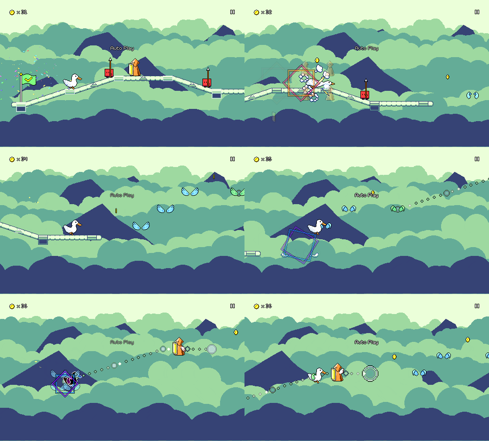
Level 2-5 was a prime candidate for a visual touch-up since I knew I could definitely do more with the cloud layers and flat shapes. I had also struggled with the color palettes for this level in particular...it's not shown here, but during a later section there's sort of a "rainbow clouds" thing going on, which looked very colorful, but also made the background very busy.
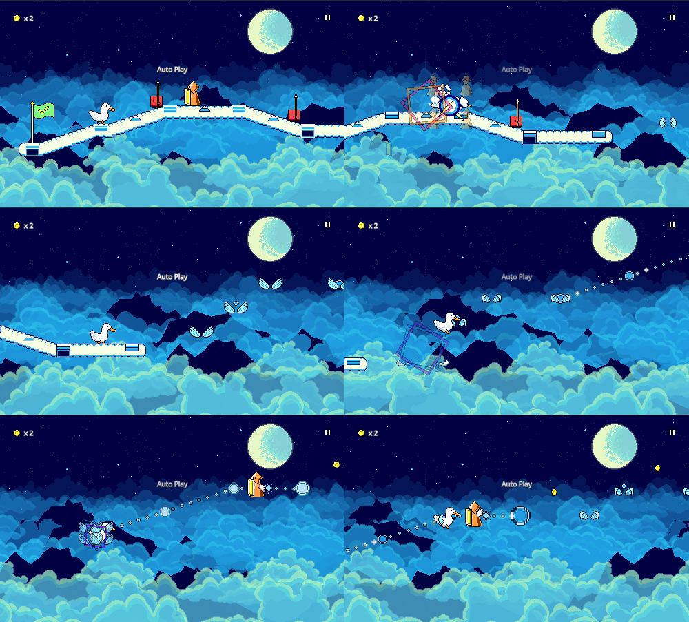
These graphics received essentially the same treatment as the revamped backgrounds for level 2-1: more cloud layers, transparency/blending to create color gradients, and more detailed cloud shapes and shading (drawing out each cloud layer's highlights instead of having them be flat shapes).
The concept of a "sea of clouds" that some dark mountains poke out of remained the same, but instead of the light background, I darkened the sky and added stars to give a nighttime feel. This not only worked out better with the color blending but set the level apart from the bright clouds in level 2-1 and provides more variety across world 2 as a whole (levels 2-3 and 2-5 are dark, while the other 3 are bright). Here's the new backdrops in action:
Level 1-1 Backdrops
Next on the docket was trying to finally rework the good old simple "triangle mountain" backdrops for level 1-1, which have pretty much been in place ever since the very beginning of Rhythm Quest's development:
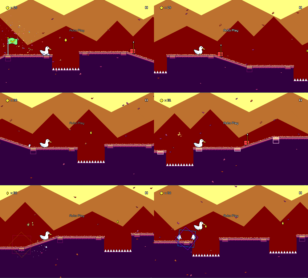
I wanted to try a background with some cloud layers (I've gotten a LOT of practice drawing clouds over the past months), as well as some sort of grassy hills, to fit the "sunny grass and blue skies first level" trope that's common in games, but beyond that it took a few attempts for me to figure out exactly what visuals to layer on top.
Here's an initial attempt with a bunch of background platforms, sort of invoking a similar feel to some levels from Super Mario World (?). While it looked "cool", I also thought it was a little distracting, and potentially visually distracting, to have elements of the background look like parts of the level that should be interactable:
Another rough version I experimented with had trees and bushes, with shaded highlights, but I wasn't a fan of how it came out:
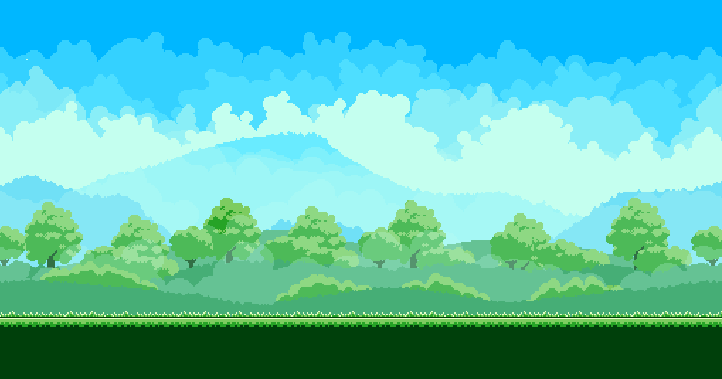
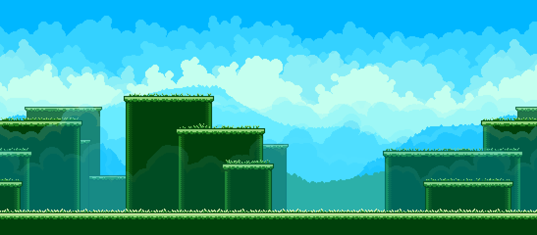
The final direction was a little more minimalistic, with the trees and bushes being suggested as small silhouettes among the scrolling "grassy hill" layers. This was unintentional, but together with this particular color palette, I basically managed to capture the general design of the default desktop wallpaper in Windows XP...
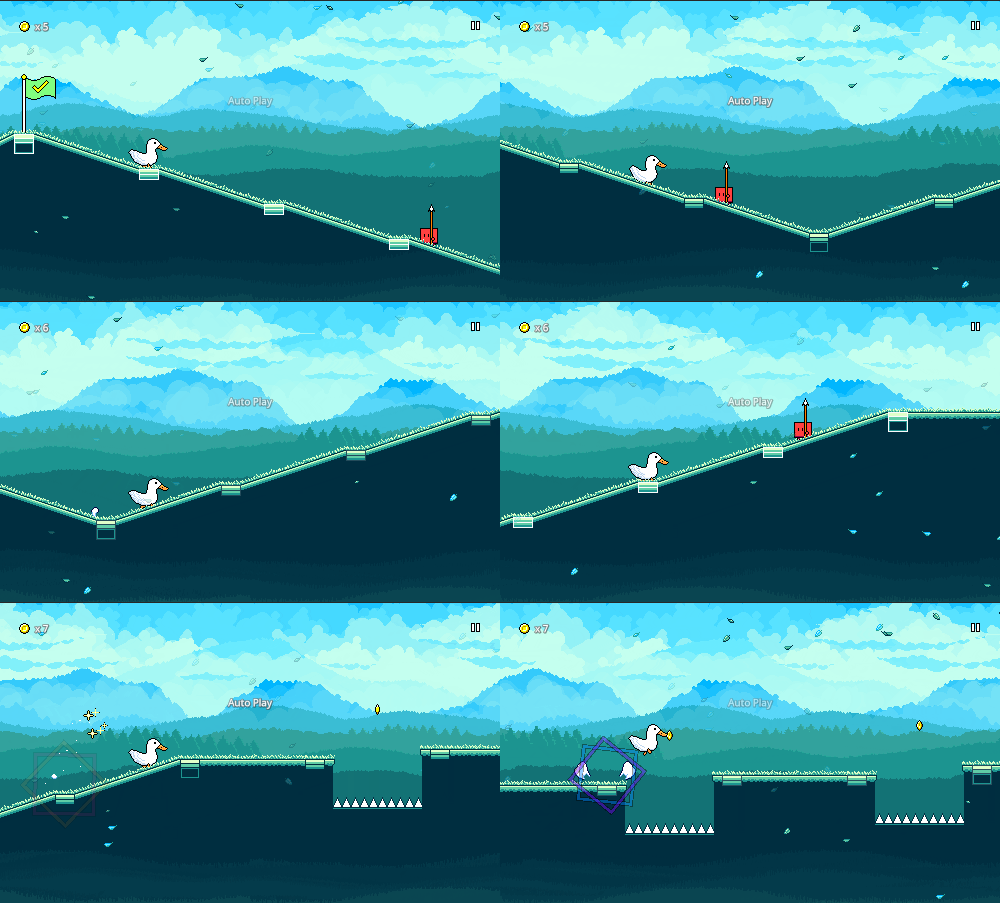
There's also some faint scrolling hills in the foreground, but I wanted to keep those minimal, as they remain in a fixed vertical position (so they're always visible even while the level ramps upward and downward), so drawing too much attention to them makes them look like sea waves that move up and down.
Level 1-1 Checkpoint
One other issue had been bugging me about level 1-1 (and potentially about future levels). At the main chorus/peak point of the song, the scroll speed/running rate increases. This has been something I've been pretty adamant about keeping in, as it helps to increase the "feeling" of intensity in a song even if the overall rate of notes stays constant.
The issue is that people who aren't familiar with the level get caught off-guard by the change, especially those who are reading the level visually rather than by their sense of rhythm (which seems common). If you know what to look for (using the beat markers on the ground as a reference) it's easy to anticipate, but I've seen that players don't know to look for this and are often late to the subsequent jump as a result.
At some point I backed off on the amount of the speed change, but I was still worried about this, as I didn't want this key moment to be marred for a bunch of players. My first instinct was to add some sort of visual indicator that indicates that a speed change is coming. Here's an attempt of that in action:
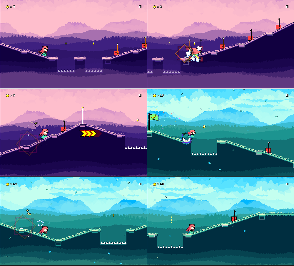
It's not terrible, but it still doesn't afford a ton of time to react, and it still says nothing about =how= the speedup is going to feel. If I wanted to, I could use this to establish a consistent visual signal for future levels, but I'm unsure of how much it would help players on their first go at level 1-1, which was the main issue at hand.
The more graceful solution to this -- which I had been avoiding -- was to just make sure that there are a few empty beats before the next obstacle. So I got rid of the jumps in the first section:
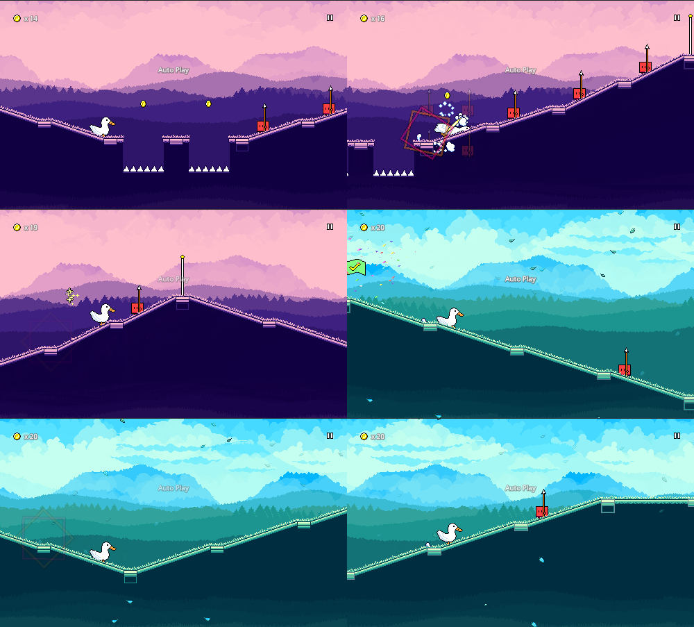
While this sacrifices a little bit of chart intensity at the start of the chorus, I like it better as a clean solution -- it provides a clear period of time for you to get adjusted to the new speed. My main reluctance had been that "the chart has always been this way", and it felt strange to remove the jumps without removing the corresponding musical cues (removing those in the music felt even more odd). But after getting used it to it, I'm on board with it -- if anything, it also gives a little more breathing room to appreciate the extra colors and particle effects that get introduced here.
The hard difficulty chart doesn't make the same affordance, though, so that one remains unchanged. I don't expect most players to start there anyways -- and if you do, I think it's ok to throw you for a little loop if you're not prepared. Because the hard chart is slightly more dense, it's perhaps also more likely (?) that you'll be looking ahead at patterns in a rhythmic way instead of simply reacting to individual obstacles visually as they come.
Level 2-4 Backdrops
I actually remember being very satisfied with the old level 2-4 backdrops at the time that I drew them, but besides the general lack of detail and layering, the harsh contrast between the dark and light sides of the big mountains in the background is distracting:
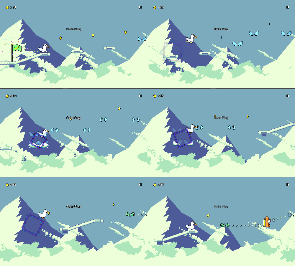
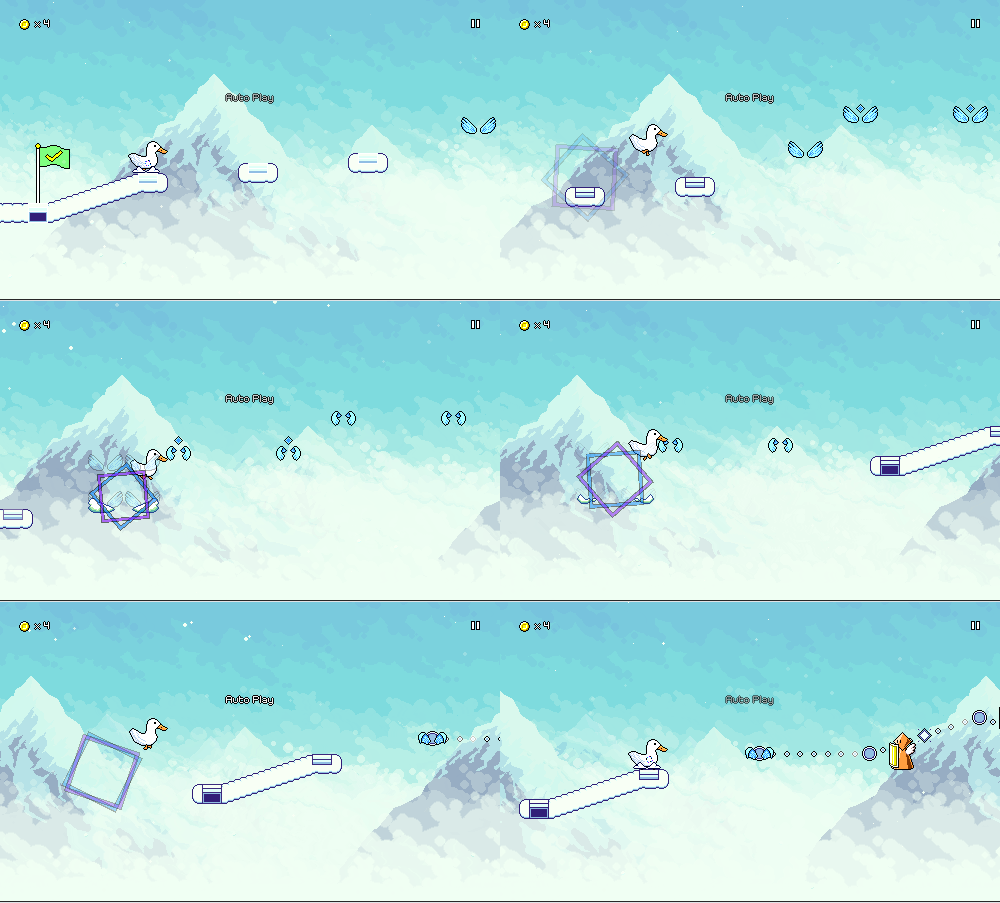
The concept of the newer version is exactly the same -- snowy mountaintops peeking out of a sea of clouds -- but with more layering, better detail, and softer colors. It took several attempts to nail down a natural-yet-scraggly pattern on the mountain peaks, but I eventually managed to put something down that I'm happy with:
Main Menu Rework
The main menu / title screen has also gotten a much-overdue facelift! The old version featured the age-old triangle mountains that were originally shared with level 1-1:
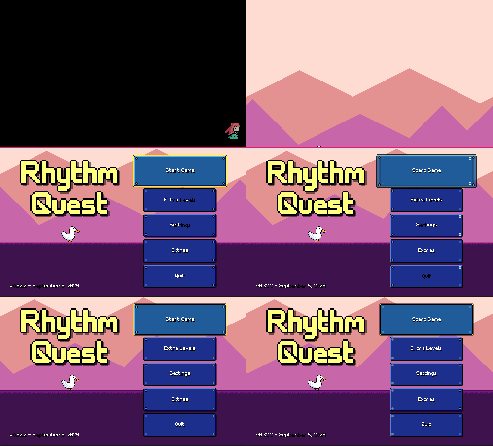
I wanted to keep with the pink/purple hues that I already had (also featured on all of the game's cover art and promotional material), so I drew from a lot of references of cherry blossoms to draw these pink-colored trees and bushes. It took some time, but I got into a good workflow of being able to build out the shading of each tree or bush cluster in layers. From there it was just a matter of figuring out how to make the coloration work for all of the cloud layers and other elements, and then adding some falling petal particles:

UI Theming
You'll notice from the above that the text and buttons in the menus have been updated as well! This is part of a larger UI rework that I currently have in progress. For starters, I finally revisited the default font in the game...
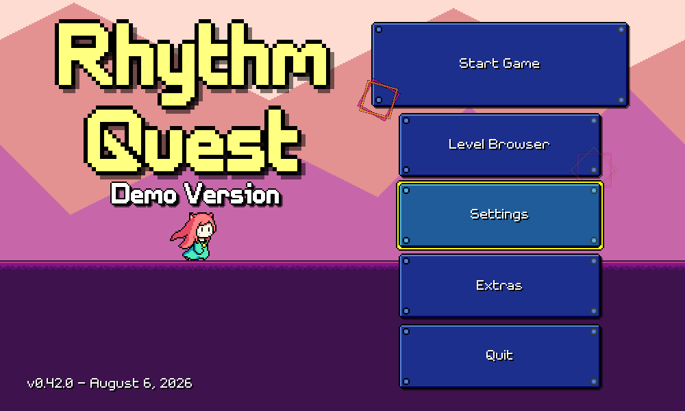
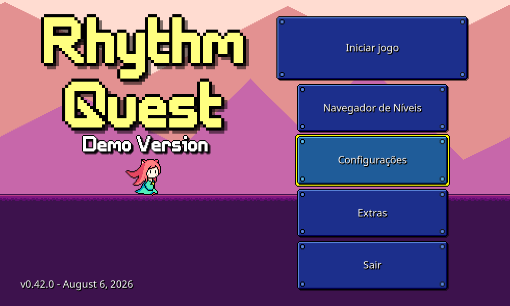
While I've definitely grown to associate this font (from ChevyRay's original Pixel Fonts pack) with Rhythm Quest, over time I came to admit that it wasn't super easy to read. The problem is that I also didn't love the look of the smooth font that I had (also shown above)...it may have been more readable, but also more plain and boring, somehow.
Here's an intermediary attempt where I was trying to make everything really cute -- pink buttons to match the pink hues of the background, plus a really rounded and squishy font:
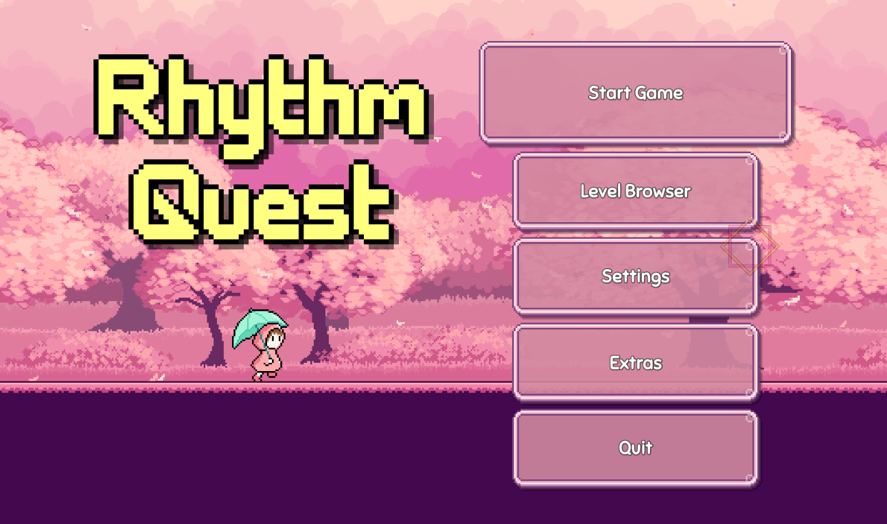
In the end I pulled back a bit and settled on this for the text. It's actually the original smooth font, just with additional thickness applied to it, and an outline instead of a shadow effect:
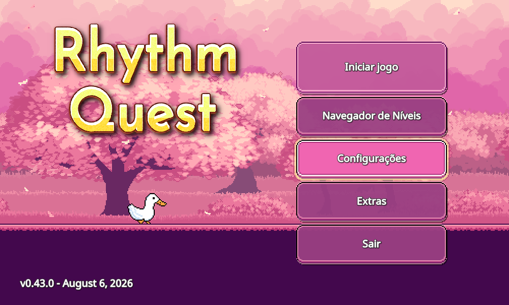
I like how the new text reads, enough that I decided to make this font style the default moving forward! (of course, you can still switch to the pixel font in-game, for those who prefer that style). The other big thing was replacing the pixelized title with the stylized gradient version from the game's cover art.
For now I've landed on a darker purple hue (exact color TBD) for the buttons, and redrawn them to be less boxy and more rounded. The "corner bolts" of the old buttons are gone, leading to a cleaner style instead of something that looked more mechanical (instead, the borders of the buttons now pulse to the beat). While I miss the old blue buttons, the new style has grown on me, and I think reads more cohesively with everything else going on.
Readability Tweaks
I also spent some extra time going over various backdrop sets and trying to make sure that they weren't too busy or contrasty. The revamped backgrounds from level 2-2, for example, looked good, but the water was really saturated, so the horizon line stands out a lot even though it isn't relevant for gameplay:
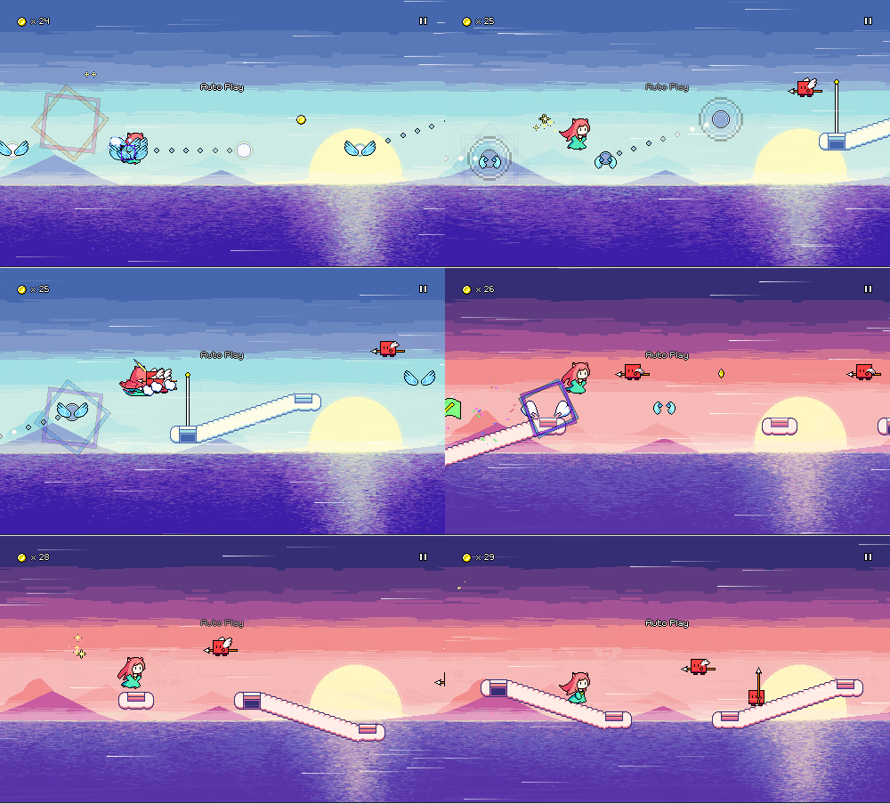
I tweaked this by simply overlaying the white (cloud) color on top of the entire water portion, so it looks more faded out, bringing more focus back to the level in the foreground:
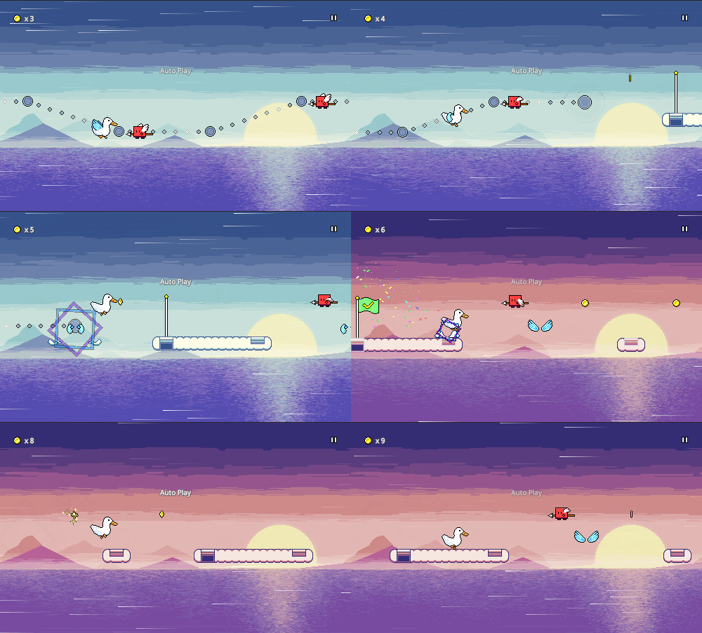
While I was tweaking color palettes and such, I also noticed that there were certain darker palettes where flight paths weren't as visible as I would have liked them to be. By default (without color skinning/readability options) the flight path "dots" use the exact same colors as the rest of the level, which provides a sense of visual unity, but also means that they aren't as distinct when those two colors are similar to the surrounding backdrops.
This has been tweaked, so I always blend a little bit of white with the brighter "rim" color, ensuring better contrast against the black outline no matter what color palette is used. The white "pulse" effect that's in time with the beat has also been expanded, and looks a bit brighter as a result. The difference is subtle but should help a bit with readability in these cases.
Here's a direct comparison, with the old graphics on top, and the newer ones below:
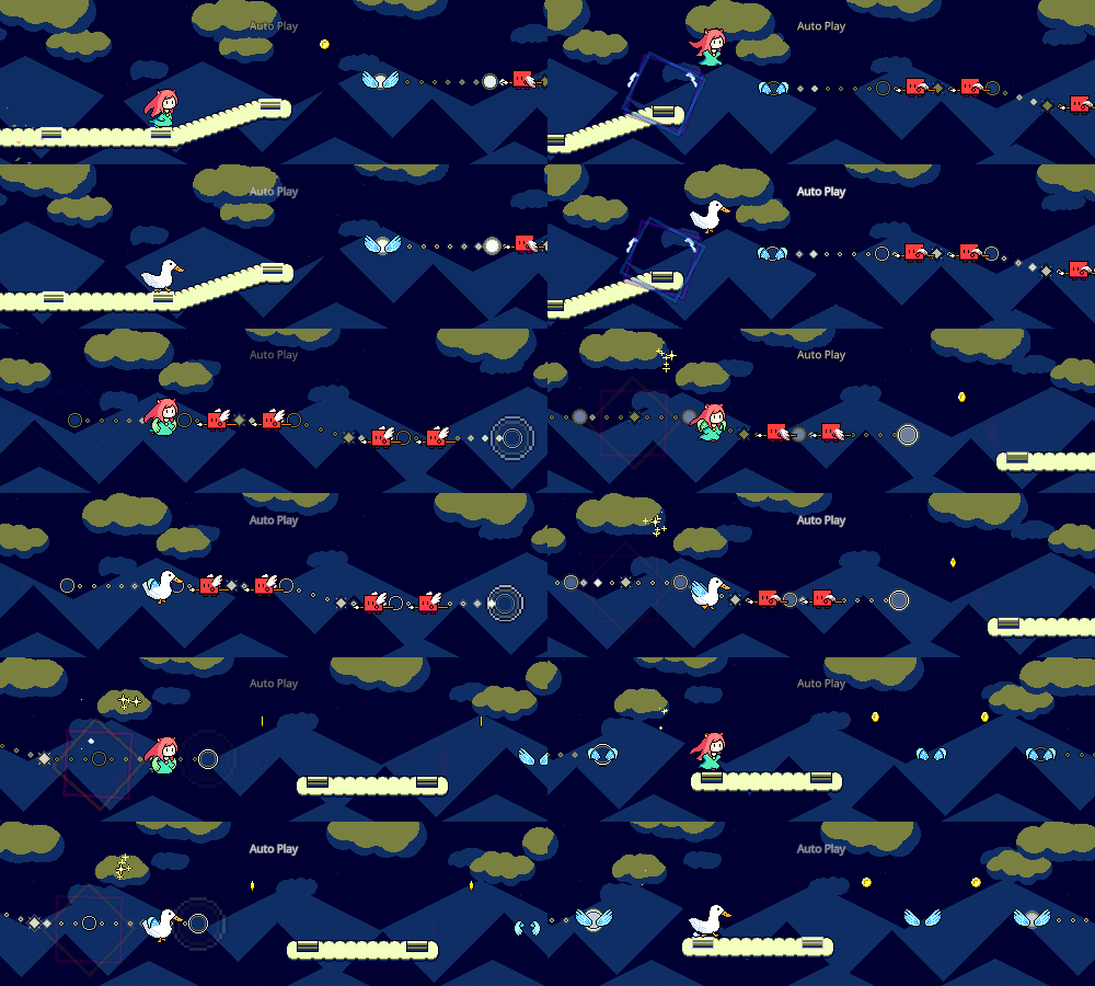
(If you look very closely, you might also notice that I fixed a bug where the last couple of dots in each flight path "segment" were mistakenly triggering all at the same time, instead of following a smooth timing)
Particle Fading
I've already started to intentionally design my backdrop art so that the middle section of the screen tends to have less detail and contrast, to make the level obstacles easier to read. Something else I did along the same lines was implement a system where I reduce the opacity of any particle effects in the middle of the screen:
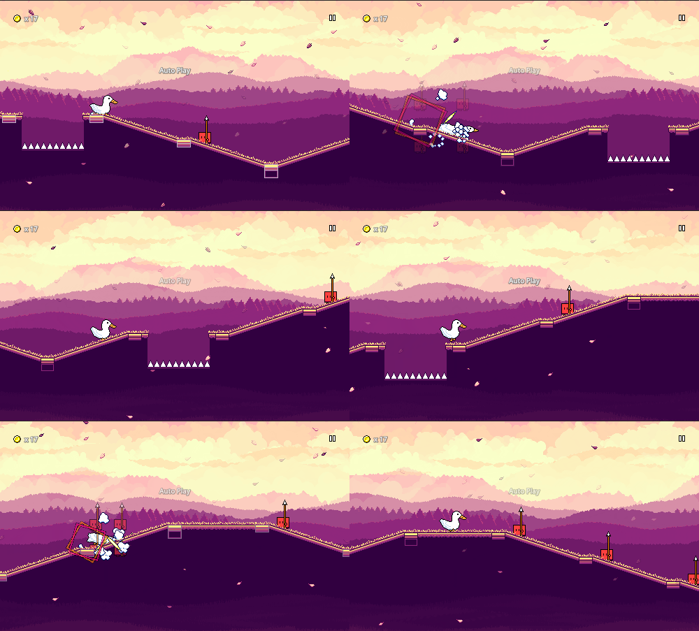
This is the kind of subtle thing that you might not notice consciously until you look for it, but it tries to keep the visual impact of the particles intact while not cluttering up the main play area. While I could have taken the easy way out and simply chosen a horizontal slice of the screen for this to happen, I actually went the extra mile and do it based on the actual level geometry -- so, the particles fade dynamically depending on how far they are from the actual track (and its ramps/jumps), not just their vertical position on the screen.
As you can see, a lot of visual polish has taken place over the past month! Moving forward, there are some bigger UI/UX flow reworks that I hope to tackle -- hopefully I will have updates on that in the next devlog!