Devlog 8 - Menu Rework
Published: July 25th, 2021
So I didn't have the most productive past ~two weeks, mostly due to extra stuff happening in my life. I decided to stop work on gameplay stuff (partly because I had exhausted my gameplay ideas for now), but I managed to get a lot of UI work done instead.
A lot of this work isn't particularly glorious or exciting, but a lot of dull work often goes into making a game polished and robust. I did manage to work in some neat music reactivity, so I'll talk about that as well.
Before and After
Here's a video showing roughly what the menu looked like to start with:
I hadn't spent a lot of time working on this, so it's understandably pretty basic. There's no keyboard navigation support, everything is super basic and bland, and there's tons of empty space everywhere.
Now, here's a video of the menu in its new state:
There's still some more work to be done here, but it's certainly come a long way!
New Button Graphics
The old buttons were designed a looooooong time ago and basically referenced the plain blue window style in some of the Final Fantasy games:
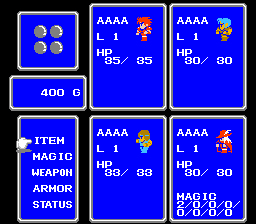
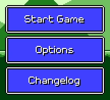
One issue here is the lack of contrast between the button background and the white font, especially for the "selected" variant of the button. That was easy to fix (just use a darker color...), but I also wanted to look at some other ideas for simple button shapes that looked a little less busy. At this time I was also trying to brainstorm ways to make the menu react to the music "somehow", without being too distracting. I knew the button graphics could play into this.
I knew that I still wanted a pixel-art-styled button graphic, similar to something you'd see in a classic video game, so I looked around at a few different examples of rectangular windows and menus in older games:
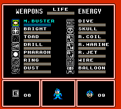
In the end I decided to just draw out a simple flat (darker) blue shape, doing away with the distracting white border. I added some light shading and four circles on the corners as accents.
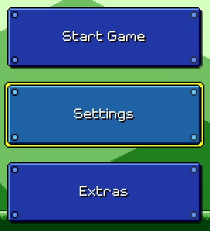
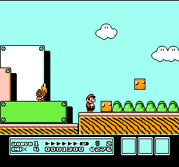
The four corner accents actually call back to these rectangular level structures from Super Mario Bros. 3:
Music Reactivity
One of the main goals for this entire rework was to add some sort of music reactivity to the menu system. During the ~1 year period where I had stopped working on Rhythm Quest, I had been doing a lot of thinking about how to make an interesting and appealing menu system without involving a ton of work (i.e. beautiful art which I'm incapable of drawing). The answer ended up being to bring the "music-first" ethos of the gameplay into the rest of the game.
For some interesting context, back in the day (around November 2017) the level selection screen was actually a full-fledged Super Mario World-like map scene:

This was pretty cool, and if my strengths were a bit different I would have explored this idea a little more, but it became apparent that trying to do this sort of art wasn't really scalable for me, at least not in this form. More importantly, the map just wasn't...interesting enough. It wasn't bad, but it wasn't really super exciting either.
I realized here that I really wanted some sort of music-reactive map. I probably could have explored some sort of Super Mario Bros. 3 style graphics with simple animations that synced to the beat:
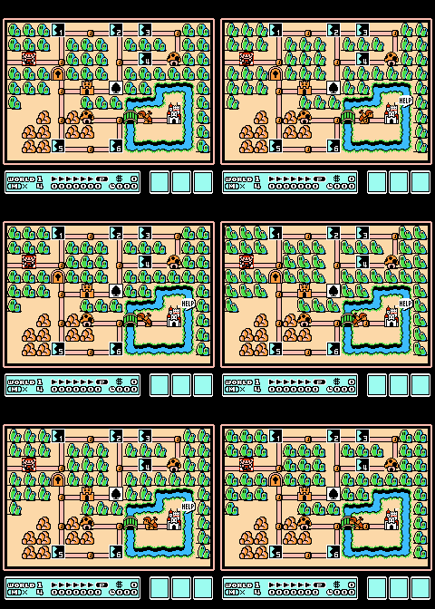
...but in the end I decided to not pursue this idea and scrapped it in favor of a simpler (but hopefully more effective) menu screen.
Beat Sync
Fortunately, music synchronization was already more or less a solved problem for me at this point. See Devlog #4 for an explanation of how that works. I haven't explained how to tie it to the actual beat of the music, but that's not too hard:
float GetIntensity(float offset, float patternLength) {
    // (Gets the current time, then converts from time to beat)
    float beatOffset = MusicController.CurrentBeat();

    // Wrap based on beat pattern length and take the difference from our target.
    // (note: the % operator will give negative values in C#, so I use a wrapper)
    beatOffset = Utils.ModPositive(beatOffset - offset, patternLength);

    // Normalize to 0-1 based on duration of the pulse.
    float pulseProgress = Mathf.Clamp01(beatTime / _pulseDuration);

    // Apply some easing (ease out quad):
    pulseProgress = 1.0f - (1.0f - progress) * (1.0f - progress);

    // Invert so that we go from 1 to 0 instead of 0 to 1.
    return 1.0f - pulseProgress;
}
So now, making the beat-matched pulsing effects was pretty simple. I made a generic script which can modulate either the opacity or the scale of a graphic based on a given beat pattern, and then applied it to various graphics that were overlaid on top of the base button sprite:
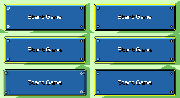
I wanted each separate menu screen (main menu, settings, level select) to potentially have its own music, so I store these beat patterns in the controller script for each menu -- the button graphics find their parent menu on scene initialization.
There's also some spinning visual effects that come in during the second half of each musical phrase:
Same idea, but instead of modulating an existing graphic, I just spawn a visual effect at one of the defined points (the effect takes care of deleting itself once finished). These are actually just the same as this visual effect from the main game, which is made by taking two colored squares and rotating them in opposite direction while fading out:
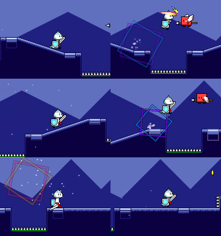
If you look closely, you'll notice that the spinning of the squares slows down as they fade out. This is done by using an aggressive easing function: easeOutQuint. If you're handling the rotation yourself, you can reference the helpful easings.net website to lookup these easing functions, but I happen to be using the LeanTween tweening library, which lets you apply these quite easily:
LeanTween.rotateAroundLocal(
    gameObject,
    Vector3.forward,
    _rotationDegrees,
    _beatDuration * beatLength
).setEaseOutQuint();
Music Transitions
Transitions between menu screens are done via a simple slide animation. As I mentioned earlier, different menus can also have different background music loops:
The naive way to implement this would have been to simply crossfade between the two pieces of music during the transition animation. However, I wanted to go a step further, since I had a big intention to try and push the "music first" ideology to as many little elements as possible.
There's all sorts of possibilities for how to handle this. For example, you could predefine set "transition points" in the music (at the end of every measure, for example). Then, when the button is clicked, you can schedule a musical transition at the next transition point, and wait until that happens to execute the slide animation. The problem with this is that adding this sort of delay to the UI interaction fels really annoying and slow. I played around with a variant of this idea a little bit, but in the end decided that it was best if I had the transition always start immediately.
I could still, however, modify the speed and duration of the transition to make it line up with the downbeat in a pleasing way. To do this, we can simply take the current (estimated) playback time and then calculate the time of the next downbeat:
// (Note that this time will never be "exact" since AudioSettings.dspTime runs on a separate timeline)
float currentTime = (float)(AudioSettings.dspTime - _audioDspStartTime);

// (Simple conversion that uses the BPM of the song)
float currentBeat = _song.TimeToBeat(currentTime);

// Find the next downbeat.
float transitionEndBeat = Mathf.CeilToInt(currentBeat);
float transitionEndTime = _song.BeatToTime(transitionEndBeat)

float transitionDuration = transitionEndTime - currentTime;
That's pretty much the basic idea, but there's a problem. If the transition happens to start just before a downbeat (e.g. currentBeat = 0.9), then the transition will be jarringly fast. To fix that we can simply add a minimum buffer time so that the subsequent downbeat will be used instead. (This will also help with audio scheduling latency)
// We could add the buffer in terms of beats or in terms of seconds.
// Either way is equivalent here since the entire main menu (currently) has constant BPM.
float transitionEndBeat = Mathf.CeilToInt(currentBeat + 0.5f);
In addition to the slide animation, a couple of different things happen with the audio/music during this transition:
- A transition sweep sfx starts playing immediately at the start of the transition
- The new music loop needs to be scheduled to kick in at the end of the transition
- I also schedule a "landing" impact sfx at the end of the transition
- The old music loop needs to be stopped at the end of the transition
- The transition sweep sfx fades out quickly during the last sixteenth note of the transition (quarter of a beat)
At one point I played around with using different transition sweep sfx samples for different-length transitions, but in the end I realized that it was easier and more effective to just use one long sample and then fade it out dynamically based on the transition timing.
// Calculate transition "fade start" time, when we want to start fading the sweep sfx.
float transitionFadeTime = _song.BeatToTime(transitionEndBeat - 0.25f);
float fadeDuration = _song.BeatToTime(0.25f);

// Play the transition sweep sfx immediately.  Retain a handle to the AudioSource so we can fade it.
AudioSource sweepAudio = AudioManager.PlaySound(_sweepSfx);

// Schedule landing sfx for end of transition.
AudioManager.PlayScheduled(_transitionEndSfx, _audioDspStartTime + transitionEndTime);

// Schedule new music loop for end of transition.
// We need to queue it up at the appropriate offset first!
_audioSources[newMusicIndex].time = transitionEndTime % _audioSources[newMusicIndex].clip.length;
_audioSources[newMusicIndex].PlayScheduled(_audioDspStartTime + transitionEndTime);

// Loop while transition is happening...
while (AudioSettings.dspTime < _audioDspStartTime + transitionEndTime) {
    // How far are we through the fade section?
    float timeWithinFade = AudioSettings.dspTime - _audioDspStartTime - transitionFadeTime;
    float fadeProgress = Mathf.Clamp01(timeWithinFade / fadeDuration);

    // I use an exponent to affect the easing on the fade.
    // An exponent of 0.25 makes the fade happen more on the tail end (ease in).
    sweepSource.volume = Mathf.Pow(1.0f - fadeProgress, 0.25f);

    yield return new WaitForEndOfFrame();
}
sweepSource.Stop();

// Transition should be done now.  Stop the old music loop.
_audioSources[oldMusicIndex].Stop();
A couple of notes to mention about the above. First, Unity currently doesn't have any sort of "StopScheduled" functionality that will allow you to stop playback of an AudioSource given a precise Audio DSP timestamp, so the best we can do is guesstimate based on checking the time each frame. (Edit from the future: you can call AudioSource.SetScheduledEndTime, I'm not sure why I didn't just use that here.)
Secondly, this method of doing audio volume fades is actually non-ideal as it's not sample accurate at all; the volume of the AudioSource is only modified once per visual update, which only happens about 60 times a second as opposed to ~44,000 times a second as it should be. Again, Unity doesn't seem to provide a good way to handle this, so we're stuck with this solution, though fortunately it ends up being "good enough" for the human ear.
Other Stuff
That's about all that I'll cover here, but I want to stress that there is a ton of other miscellaneous work involved here that I haven't even talked about. Very briefly, this includes things such as:
- Allowing for menu navigation with keyboard, mouse, gamepad, OR touch input
- Smartly handling button auto-selection depending on input device (if using keyboard/gamepad, the first option should be highlighted, otherwise not)
- Supporting localization for all text in the menus, including dynamic text
- Supporting screen readers so that visually impaired persons can navigate the menu
- Disallowing menu input while a transition is happening
- Remembering previous menu selection (returning to a previous menu should preserve the selection state)
- Allowing for the menu scene to be loaded to a certain state (i.e. when returning from a level, it should have that level preselected)
- etc...
Unity does its best to help you with some of this -- it already provides an automatic menu navigation mapping system, and its new Input System provides (somewhat obtuse at times) means for automatically switching and detecting input devices. There's even a 3rd-party plugin which does most of the legwork for you for integrating with screenreader interfaces. But in the end there's still a lot of work (which will unfortunately go unnoticed by most) that needs to be put in in order to make something that Just Does The Right Thing (tm)...
<< Back: Devlog 7 - Build Pipelines
>> Next: Devlog 9 - Settings Menus