Devlog 12 - User Experience Flows
Published: August 27th, 2021
Thinking about how to design my user interactions in Rhythm Quest has been quite an interesting challenge. Coming up with designs that are intuitive takes a certain kind of skill and insight (and often a lot of iteration...). Designing across multiple platforms and control schemes has been particularly challenging, as the natural modes of navigation and interaction are so different when using a keyboard / touchscreen / etc.
Onscreen Buttons
Last week I wrote a bit about how I had added a controls tutorial at the beginning of the game. I was having a few problems with the mobile (touch control) version of this:
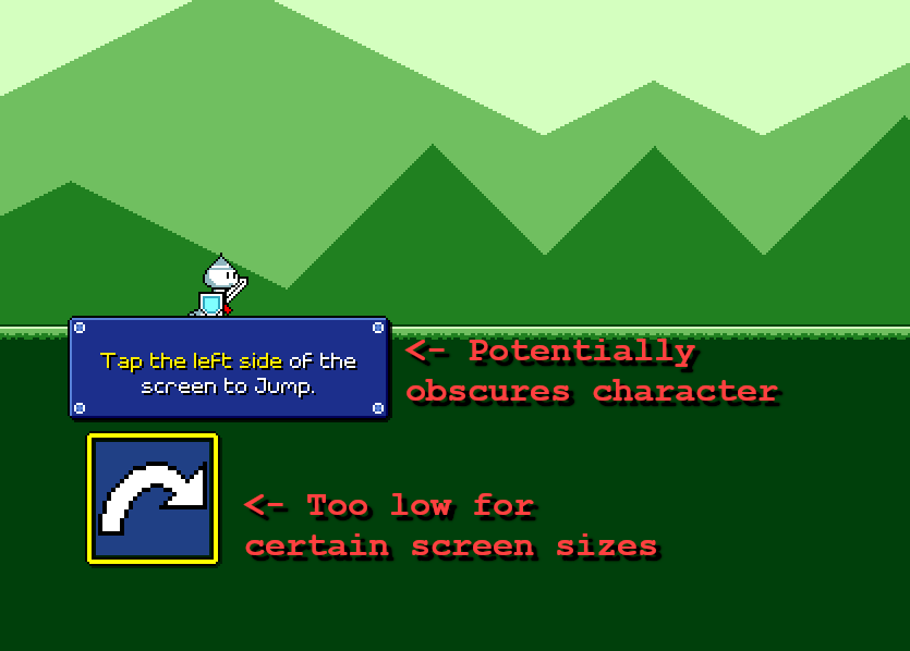
I wasn't really able to find a good placement for the instructional text here, especially across different resolutions. Placing it above the on-screen button potentially blocked the view of the character, and placing it above the character made it too far away from the highlighted button. I could place it to the right of the button, but that was too low on the screen for my likes (perhaps likely to be obscured by thumbs on a phone).
I already knew that I was having issues trying to place the on-screen button optimally for different resolutions and device sizes (that's a complicated problem that I've largely ignored), not to mention different hand sizes. It was also the jankiest-looking piece of the UI since the icons are upscaled at 2x compared to everything else (ugh!). I decided to try knocking out two birds with one stone and just getting rid of them altogether:
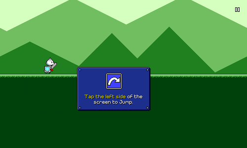
I may still have to play around with the exact positioning of this, but I feel a lot better about it. Without the on-screen button there isn't an actual screen element that lights up when you tap, but I don't think that's a huge deal since the visual focus should be on the character anyways. There are plenty of other mobile games out there that don't need to explicitly draw virtual controls on the screen.
Since we don't have the two control icons drawn on screen all the time, I've now included the icon in the tutorial dialog box itself. This allows me to show that graphic in the desktop version of the tutorial as well, which is important because I use that iconography later on in the tutorials for the different game obstacles. Speaking of which...
Flying Tutorial
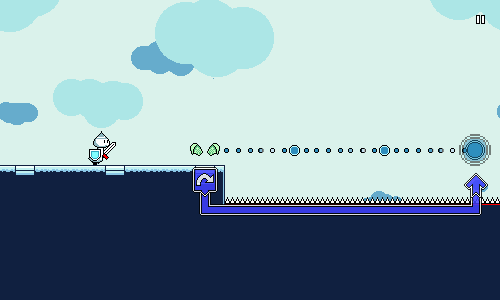
The one in-game tutorial that I've been a little worried about is the one for flying, which requires you to press and hold the jump button at the beginning of the flight "track" and release it at the end. Here's what it looked like:
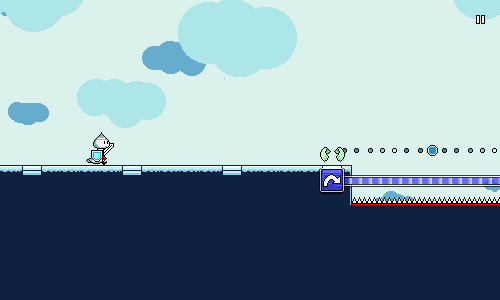
I think the horizontal bar does a good job of indicating that you need to hold the button down, but I wasn't happy with the visual iconography of using the same icon to signify a button release. Having to release the button at a specific time is the least intuitive part of this mechanic, so I wanted to try and do a better job here. As is, it could be interpreted as having to press the button again at the end, which isn't what we want.
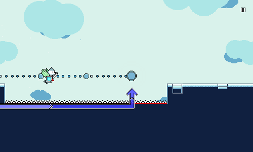
Here's my new attempt:
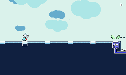
I added a vertical down and up section here to hopefully call out to holding a button (or finger) down, then lifting it upwards. I also removed the jump icon at the end of the path and replaced it with an "up" arrow. This new solution involves a few more different shapes, so I'm a little worried that it's getting too "fancy", but hopefully the up arrow will aid understanding? If I really have to, I'll add the words "hold...release!", but I want to see if I can get the visual icon component of this working by itself well first.
One thing that I do appreciate about this new implementation is that if you release the button early, the travelling marker makes it very obvious what went wrong:
One thing that I'm a little less confident about is the visual feedback for if you just keep holding the button down and don't release it at the end of the track. The visual "sort of" shows this right now, but I might need something a bit more obvious here eventually.
Lag Calibration
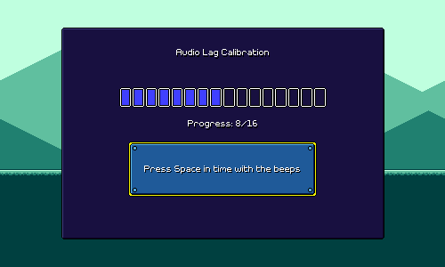
I talked earlier about designing a single-screen lag calibration system. It looked like this:
This...worked, I guess...but it's way too busy and complicated, especially for something that I'm trying to prompt the user to do before even starting the game. It's kind of cool that the screen lets you play around with the timings by yourself and essentially take control of your own calibration, but at the same time, that shouldn't be something I thrust upon all users.
What I need is something simple that I can just show to everyone that guides them through the process with very clear directions:
Less is more! The plan is to add an "advanced mode" / "manually adjust" option so that users can fine-tune and play around with the setting if they so choose, but hopefully the simple version should suffice for most people.
Settings Menus
I also wrote previously about how I was redesigning the settings screens. Those currently look like this:
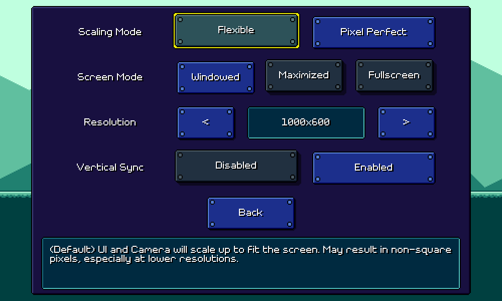
I'm pretty happy with how those are working, though one knock against it is that the description label on the bottom doesn't work super well for mobile. For keyboard/mouse flows, it's easy to hover over or navigate to an option to read the description, but for touch input, you'd need to depress the option itself in order to read it, which is a little awkward.
I also have a different (bigger) problem...this menu:
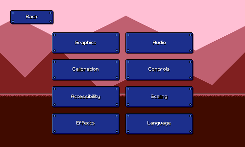
This is fully functional and very easy to understand, but it's also pretty poor design. There are eight blue buttons that are identical except for the text on them, with no sort of hierarchy or iconography anywhere.
One of the problems here is that each page of settings can only hold 4-5 options at most (otherwise the screen becomes too dense to navigate via mobile). On desktop it might be possible to make scrolling menus, but again, that sort of paradigm really doesn't translate well across all of my different input methods.
I also don't want to just create a deep hierarchy of submenus here. I've brainstormed possible ways of paginating the individual settings screens so that I can declutter the above menu, but I haven't been able to come up with something that I'm happy with.
In the end I think if I want to solve this I'll probably have to do a major redesign, where each individual setting/option has its own little popout or dropdown menu, instead of showing all of the possible options from the start. This would also solve the problem I mentioned before of description labels not working super well on mobile.
Unfortunately that's just something that I don't have the time for, as I need to prep the build for an upcoming closed alpha test. So that'll have to wait until later as I tweak other important things and try to flesh out the levels a little more!
<< Back: Devlog 11 - Odds and Ends
>> Next: Devlog 13 - Music and Level Design