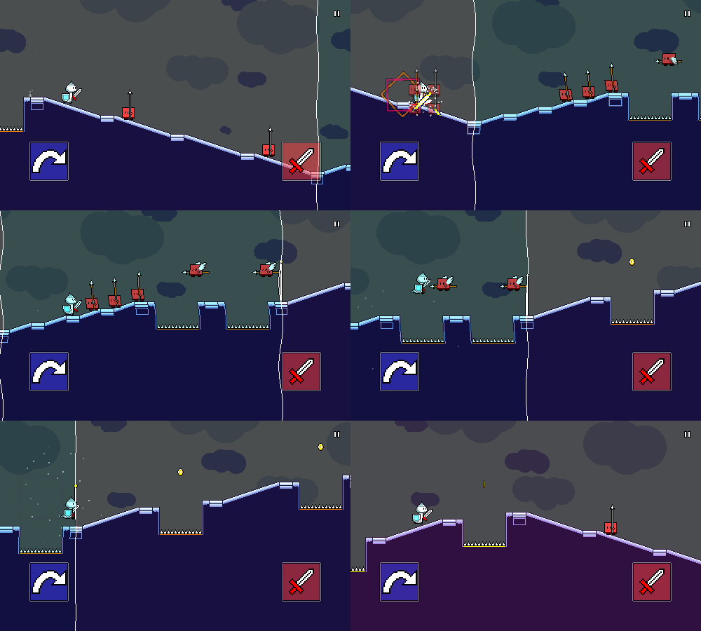
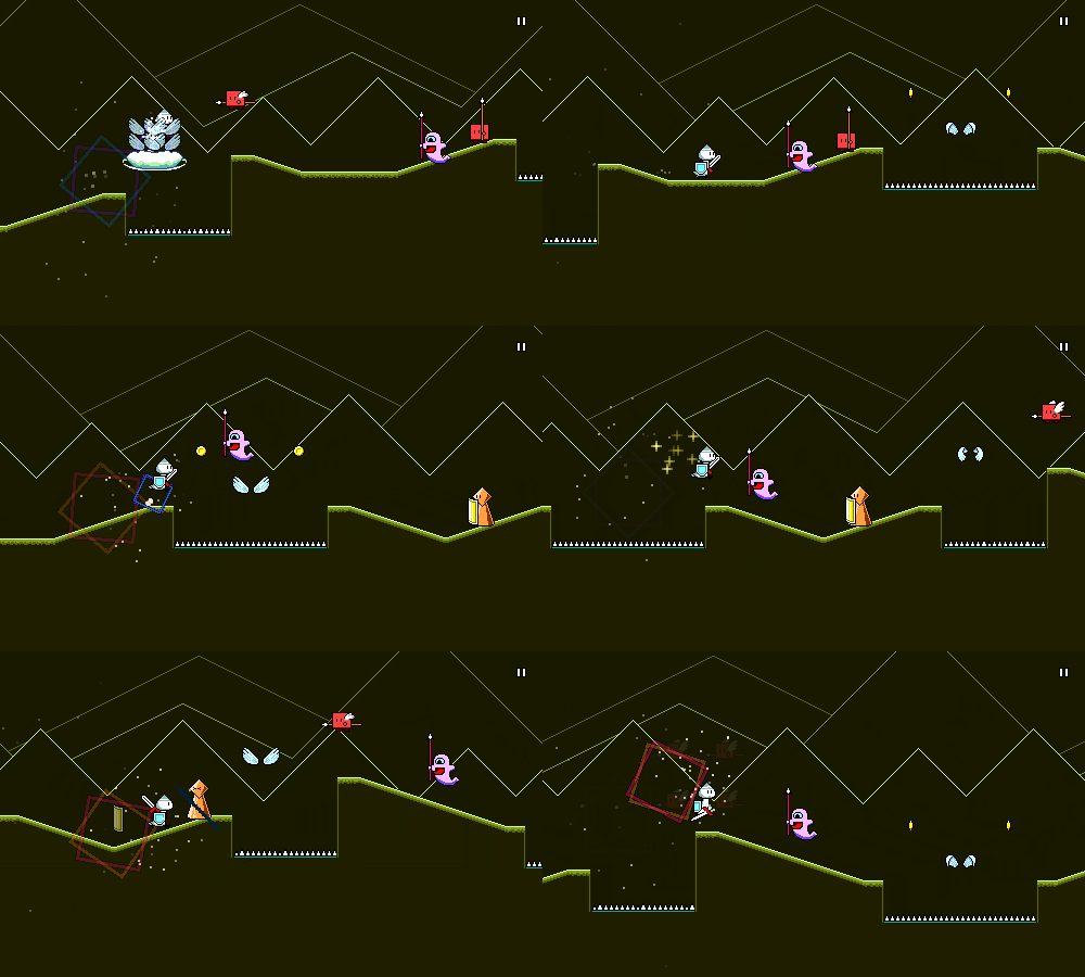
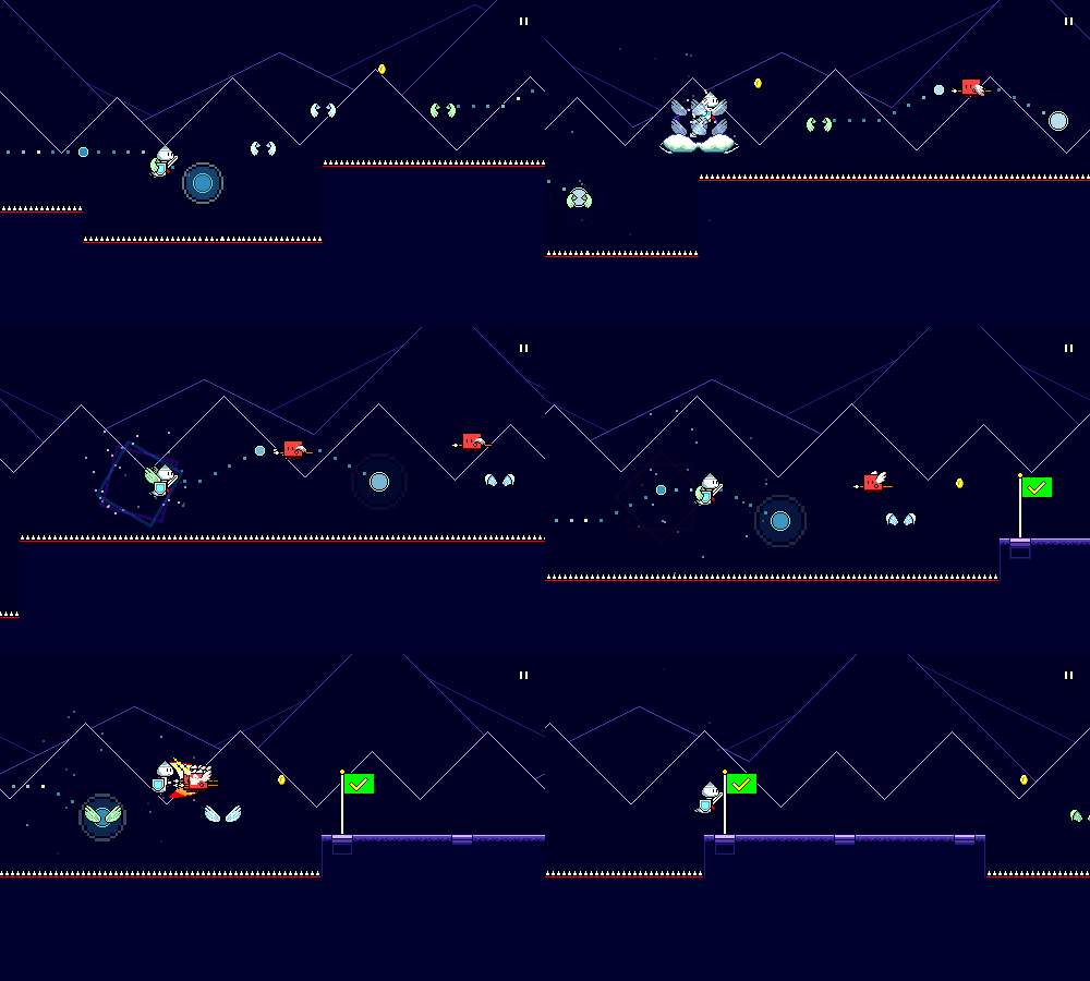
Devlog 14 - Closed Alpha Test Feedback
Published: October 12th, 2021
We're back! I've been away from Rhythm Quest for a few weeks, partly due to having a bunch of other stuff going on, and partly to just take a short break from the project. Among other things, I ended up working on a brand new two-player game for Ludum Dare 49, as well as working on some new unreleased content for our Ludum Dare 48 entry.
I also ran a closed alpha test for Rhythm Quest over the past month or so! I've been developing the game mostly in isolation, so this was an important opportunity for me to get some fresh perspectives on the game and see if I needed to re-evaluate certain parts of it.
Taking Feedback as a Creator
Before I get into it, I suppose now is as good a time as any to talk about my interactions with feedback over the course of developing this game. In my long experience as a gamedev and content creator, I've gotten a lot of feedback and critique on my works. Some of these comments are very well thought out, whereas others are more, ah..."impulsive", let's say.
There's a natural desire as a creator to want my work to be as good as possible, and in the past that has led to an unfortunate sort of trigger-happy zeal where I felt a need to immediately respond to any sort of criticism by either improving my content ("There, I've fixed it!") or by refuting the opinion ("No, you're wrong because...") Without going into how this may or may not tie into personal insecurities or whatever, any content creator can tell you that this is a pretty unhealthy way to interact with feedback.
This is all probably obvious stuff in hindsight, but I sort of had to learn about it the hard way; I needed to unplug myself from the direct feedback cycle and take a step back to realize that people are just expressing whatever they happen to think in the moment and my job as a creator isn't to respond to every single thing, but rather to evaluate it in a separate process and determine what it means for me moving forward. Everyone is probably going to have a different way of dealing with this sort of thing, but for me I found that I needed to be mindful of when and how I interact with outside feedback.
What the Test Included
The main framework for the game was all in place, including the menu system (though some settings aren't implemented), a basic initial lag calibration prompt, and a tutorial to walk you through the controls.
The game had 6 general mechanics which were introduced throughout the stages:
- Basic enemies
- Jumping
- Mid-air flying enemies
- Double-hit enemies
- Mid-air jumps
- Flight paths/flying
- Rolling spikes
- Teleporting ghosts
Notably, the triplet-based water slowdown mechanic was not included because I wasn't quite happy with it and want to try to rework how it functions.
There were 9 levels: 4 in world 1, 3 in world 2, and 2 in world 3. My current thinking is to have about 5 levels in each world, so there were some missing levels, which impacts the difficulty progression (difficulty probably ramps up slightly more quickly than it should). But for the purposes of a test, I'd rather have people play through a greater spread of difficulty than concentrate on only easier levels.
Stability and Performance
I was actually a little bit worried about the performance of the build going into the test because I had been doing some testing with an Android device that was getting pretty poor performance, but I spent some time on optimizations and it seems that for the most part people reported that everything felt smooth!
Surprisingly, a significant portion of my optimization work actually ended up being on shaders -- there's a pixel shader that is used to render all of the level graphics that allows me to modulate the colors at each new checkpoint. Internally this is done by converting from RGB values to the HSV color space, applying a hue adjustment, and then converting to RGB, which can involve a lot of operations in the pixel shader. I might actually have to revisit this approach later, as applying simple hue shifts isn't actually ideal from an artistic perspective compared to actually just using a different unique palette for each section, but for now, the optimizations seemed to do well enough.
Unfortunately, some of my other optimization work resulted in a bug where level colliders were missing -- causing you to fall through the world. That one was hit by a majority of people, but was pretty easy to fix. I was honestly surprised that more things didn't break! There were a few minor issues with mouse/touch input, but I've since internally reworked how that is handled, so I'm not too worried about that either.
Game Difficulty
Most people seemed to think that the difficulty was either just right or a little too hard. I think that puts the game in a good place for now considering that the difficulty ramp in the demo is steeper as mentioned earlier. I may have to revisit some of the (current) later levels and adjust them to fit into the appropriate difficulty curve, but that's not really a priority at the moment.
Latency Calibration
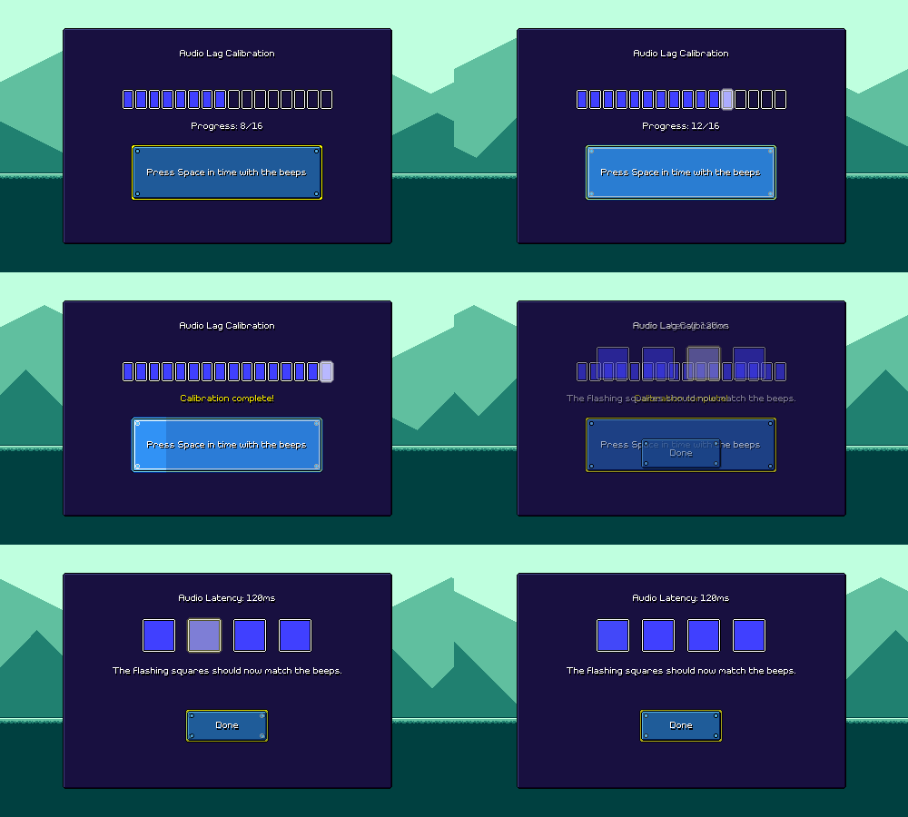
Something that I already know needs some additional attention is the latency calibration procedure for the game, as that is incredibly simple right now:
For people who really understand how to do this kind of calibration, I think there's no problem, but to a first-time user it's very opaque. The second screen tells you "the flashing squares should match the beeps", which in theory lets you verify that you performed the calibration correctly, but realistically there's no good way to distinguish a 30ms offset by this simple eye test.
Another issue is that there's no sort of visual reference for the calibration process. That's...by design. By definition, since the audio/video latency offset is unknown, any sort of visual reference will be inaccurate, so this test relies on the player tapping purely based on the audio. However, that's sort of bad UX, and it's very easy for people to slip up on the calibration, become impatient, have a bad sense of rhythm, etc.
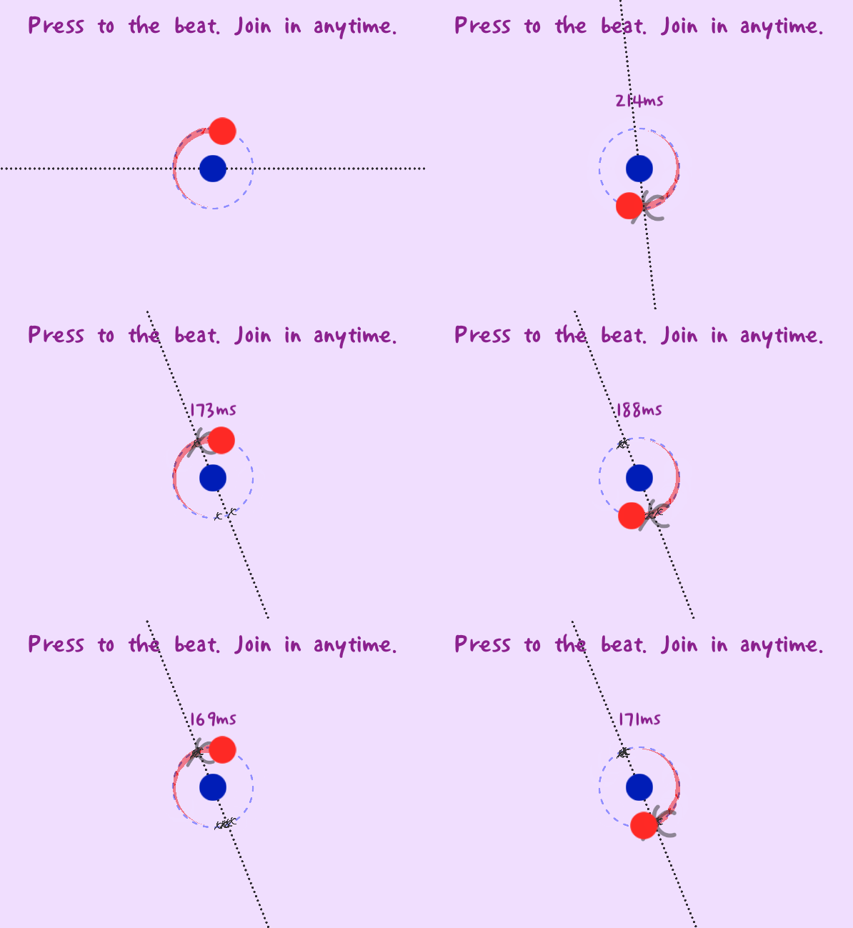
We can look at some possible solutions by taking a look at A Dance of Fire and Ice, by fellow rhythm game dev fizzd:
ADOFAI gets around the issue of visual reference by making the visual reference relative. Before the test begins, we don't know what the audio/video offset should be, but as the user taps, we can use their progress so far to make an educated guess. This may be a bit inaccurate at first, but the idea is that we'll eventually zero in on the correct offset as the test progresses.
Of course, strictly speaking, this visual offset is actually detrimental to getting a "pure" calibration. If any of your taps are inaccurate, then the visual reference guide will actually mislead you a bit based on that inaccuracy. So, the best "pure calibration" is actually done with your eyes closed, focusing on matching the sound of your tap to the sound of the beat. (rhythm game players already know this) But that's a small price to pay for something which works arguably just as well in practice and provides immediate visual feedback.
The other thing you'll notice is that through this calibration process, it's easy for the user to see whether their taps are consistent or not. In fact, we can have the game do this for you as well, and prompt you to recalibrate if it detects that your taps were too imprecise or variable.
Now, I could straight-up rip off of ADOFAI's calibration screen (it's just some circles and lines...), but that might be a little incongruous with the rest of my game. But I'm sure I can take the same general concepts and work them in somehow.
Flight Paths Tutorial
I already wrote about this in a previous devlog. It's getting closer, but could use some extra iteration.Extra Attacks
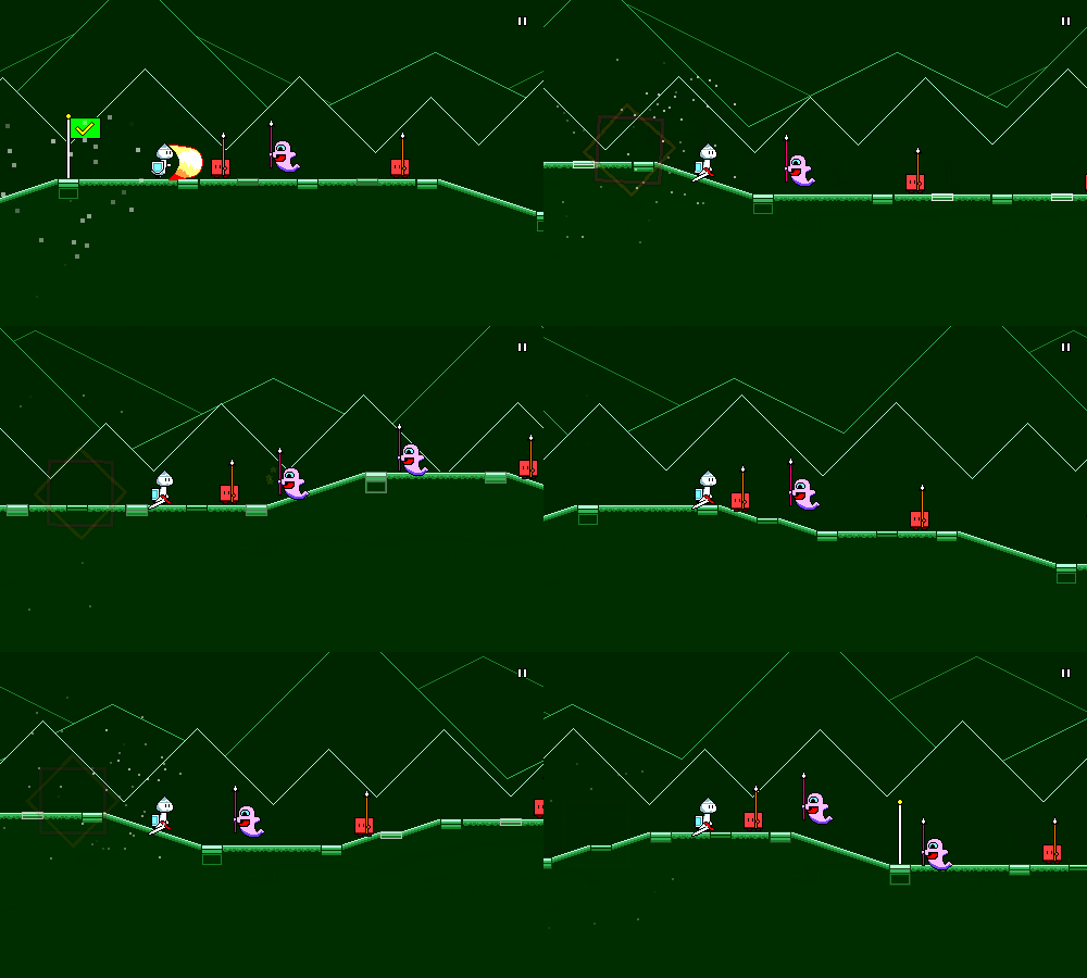
This is an interesting one. I got feedback from multiple people about wanting to slash freely during "downtime" sections where there are no enemies. Currently that's not possible due to a global 0.4-second cooldown after missed attacks. Of course, when actually hitting an enemy, this cooldown doesn't apply (otherwise double-hit enemies would be impossible), but this is by design to prevent people from mindlessly spamming the attack button (off-rhythm, even) and still clearing all of the obstacles perfectly. Here's what that looks like:
Other rhythm games like DDR use a judgment system to deal with this issue -- if you spam all of the buttons constantly, you end up hitting every note too early, which results in lower scores / a broken combo. However, Rhythm Quest intentionally has no judgment system beyond hitting or missing a note, as I want to maintain a sort of simplicity around scoring. My timing windows are lenient for this reason as well -- you can sometimes be a 16th note / 125 milliseconds off in either direction and still get credit for the note (this would break combo and barely be a "good" in DDR).
For the most part, there's nothing that's negatively affected gameplay-wise by the current system -- when people are busy zoning in on the actual rhythms, this is a non-issue. It's just during the other times when people feel the need to play around, "Parappa" style, if that makes sense. But whenever it seems like enough people are feeling limited by the design, it's a sign to me that there's something there.
There's a couple of things that I can try out here. The simplest thing to do is just to avoid fighting people's natural instincts and just reduce the global cooldown. As mentioned above, this opens the door to abuse, but there are two reasons why this is potentially okay. First, Rhythm Quest is not a competitive game, so whenever I'm choosing between player comfort/leniency and strict skill-testing evaluation I'm going to err on the side of the former. Second, the mashing strategy works, but is tiring, unsatisfying, and ultimately distracting during later stages when jumping must also be considered.
I should note that this problem is mostly avoided for jumping because jumping naturally has a built-in cooldown which doesn't feel unnatural, and because there are held notes which prevent you from mashing mindlessly. I could of course introduce held attack notes as well, but that's not currently on the docket.
Coins
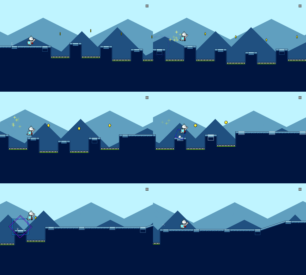
A couple of people were confused and/or curious as to what the in-game coins would be used for, which is only natural given that coins are a universal stand-in for "collectible currency" in games. For Rhythm Quest this isn't actually the case, as they're purely visual. While I like the fact that the coins are natural indicators of jumps, ultimately if they're going to raise more questions than they are going to answer, then I need to think about changing their representation in some way, or just straight out removing them.
The other thing I could do is to again stop fighting people's natural inclination and actually turn them into a currency. I hate this idea because there are so many problems with it -- coins are basically unmissable right now, and different levels will have different numbers of coins associated with them. But I could think of some sort of expanded system, such as enemies rewarding you with a coin after being defeated, etc. It just feels inelegant to introduce the idea of a "farmable" currency to the gameplay which is otherwise quite pure.
On the same note, I did have people asking for unlockable characters, outfits, etc. which I'm totally on board with as a reward for e.g. getting medals on levels. That just hasn't been a priority yet. And of course, that'll all need a bunch more UI work in order to get in (oh, goodie...).
Visual Clarity of Rhythm
This wasn't brought up a =ton= in the feedback, but it's something I've already been thinking about as I think about the visuals in the game (which haven't been touched in so long...). There are some situations that make timings (unintentionally) a little tricky to distinguish or predict. For example, discrete scrolling rate changes at checkpoints can throw people off.
Now, I do have the beat markers on the ground to help out with this. You can see for example how the beat markers are closer together here in the water section, which indicates the scroll speed slowing down:
This sort of works, but I've found that it's not very noticeable to most people. Also, the fact that the beat grid markers are all flat boxes is something that's really annoying for the level generation code and breaks up the upward/downward slopes in a very unsatisfying way. Removing them makes the slopes read better:
Of course, then there's no point of reference for the beat, but my point is that perhaps the beat indicator shouldn't break up the flow of the ground, and should instead be its own separate thing instead. That's something where I'm going to have to mull over exactly what it'll look like as I think about the overall level visuals a little more.
The other (related) issue I was seeing was about how jump/attack sequences were sometimes hard to read, particularly because all of the jumping elements are visually placed on the beat, whereas all of the enemies that you attack are placed directly =after= the beat:
Now of course, intuitively this makes sense -- you need to sword slash an enemy before you get to it, not as you collide with it -- but the offset sort of throws off the visual "grid" of rhythmic elements, so to speak (this is one reason I wanted ot have the beat grid indicators as a reference point). I could change the core conceit of the game such that instead of "slashing" enemies, you "absorb" them (??) or something else that makes more sense with a collision, but as is this is what we've got to work with.
Now, to a certain extent this isn't actually a bad thing. Part of the draw of Rhythm Quest is that the platformer/runner elements and rhythm game elements both inform each other, so I want to encourage people to rely on that rather than simply providing a note-by-note outline of what button to press when. But I do also want to provide enough of a visual reference point to make things easier to read as well. It's a balance. This is something where I'm just going to have to tweak and iterate on the visuals over time. (I bet I'll have to rewrite the level generation code yet again...)
Moving Forward
Overall, the alpha test was a success! The most important part is that people seemed to really enjoy the game, and had a bunch of positive things to say. Moving forward, I'll be attempting to address some of the things I mentioned above (plus a bunch of little things here and there), as well as prototype a new version of the meter-change mechanic, and think about overall visual reworks.
There's still a ton of work ahead of me, so there's not really a chance that I'll be done by the end of the year (taking into account the holidays, etc), but hopefully I'll have made significant progress by then! [crosses fingers]
<< Back: Devlog 13 - Music and Level Design
>> Next: Devlog 15 - Palette Shaders
