Devlog 29 - Level Select Rework
Published: March 24, 2022
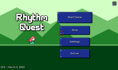
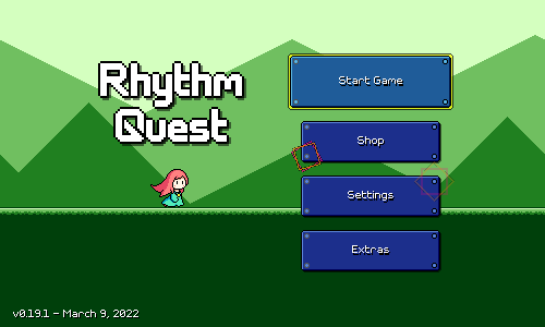
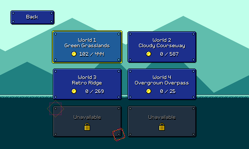
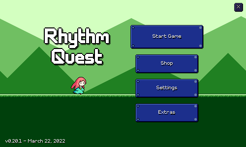
This past week I've been pretty hard at work redoing the entire level select screen. For reference, here's how the level select menu used to look like:
This works just fine and I didn't originally have any plans to rework it. I knew I wanted to implement some sort of visual animation/effect for completing a level and unlocking the next one, but that's about it. For that effect, the first thing that came to mind was having the character jump and have some sort of fanfare. But that made me think about a different way to lay out the levels -- horizontally, like this:
This was the initial prototype I made to explore the general idea. Here, the levels are laid out all in a row horizontally, and you flip between them using the left and right arrows. I mentioned in a previous devlog that a long time ago I wanted to do a sort of "world map" idea for selecting different levels. This isn't quite that, but harkens to a similar idea of having a visual "overworld" for the different levels to all reside within.
Right off the bat I liked it, as this allows me to show off the visual aesthetic of the different level backdrops. I think this helps to make the levels more visually distinctive during selection, which is something that the previous design struggled with. While the former vertical list made a lot of sense for a touchscreen layout, the new one is also nice in that it maps overworld progression with the same rightward progression that you do throughout each level.
Iterations and Experiments
I wasn't sure whether crossfading between the different level backdrops was the right idea. The character remains in the center of the screen (something else I wasn't sure about), so it might not look like anything is actually moving (?). Instead of crossfading, I considered doing a transition that didn't have the backdrops blending into each other. Something like a wipe effect. I tried that very briefly:
Very unpolished (the backdrops aren't even scrolling during the motion like they should), but this looked janky enough that I didn't choose to explore this further. In my mind I was considering some sort of "fancy wipe" as opposed to just a straight vertical line transition, but in the end I decided maybe the cross-fading was just better.
One issue with the new setup was that there was no way to jump to a particular level easily -- you have to flip through the levels one by one. I wasn't sure also whether there would be different transitions between worlds, or whether everything would just be on the same big horizontal line. It was also hard to tell at a glance your coin collection, which was a strength of the old system. I tried an alternative layout where you had a row of buttons, one for each level in the current world:
Here, the left and right arrows are for switching the active world -- at which point the entire row of buttons would update for the new world. This was an interesting idea, but had a couple of glaring weaknesses. First, there's no room to fit full level stats for each of the 5 level buttons if they're laid out horizontally, so each button can only show the level number.
Secondly, the UI/UX is clunky and non-intuitive and I couldn't figure out any elegant way to make it work across keyboard/mouse/touch uniformly. For keyboard only, it's simple enough -- just use left and right to select a level, and then hit enter to jump into that level. But what about touchscreen? Do you hit a button to scroll to that level, and then hit the same button again to actually start the level? Or is there a separate button that you press to start the selected level? How do I handle that button when you're using keyboard only?
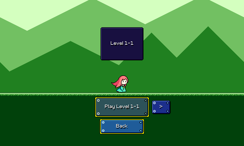
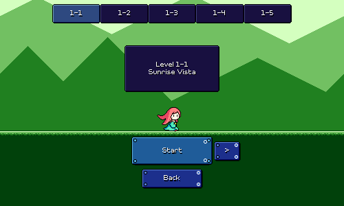
In the end I just decided to go back to something simpler. Here's version 2 of the original approach:
Still keeping the simplicity of the original idea, but a couple things have changed here. First, the buttons no longer scroll, and instead I've placed a banner at the top with the level name and info that scrolls. This is a bit cleaner since it felt a little weird having UI elements scrolling left and right, and this also makes better use of the top half of the screen real estate. Second, I added a simple diamond-fade transition for when you go between worlds, and the character runs off-screen for those. I like that this is pretty quick but still gives a greater sense of progression for changing worlds vs changing levels.
The back button is also moved to the bottom center of the screen instead of at the top-left. I like this positioning better as it's still accessible and intuitive, while looking a lot nicer and more consistent across different screen resolutions. I'm starting to change the rest of the menus to use this pattern as well.
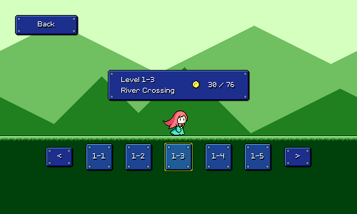
We're still missing the ability to jump to a given level easily, so I tried adding a row of small buttons at the top of the screen:
The idea here is that you can tap/click any of these buttons on the top to jump to them, and it also provides a visual indicator of which level in the world that you have selected, and how many levels are in the world. I originally imagined putting coin collection stats in each one of these mini buttons, but realized it would be weird and redundant with what's showing for the currently-selected level in the main banner.
This is...okay, but I actually really don't like how much visual attention it draws. It feels like it makes the scene too busy and detracts from the level backdrop graphics. I guess aesthetically it also just makes the scene feel less "open" since the sky area has something blocking it. So I ended up nixing this idea as well.
Reintroduction of Medals
Okay, so I was just going to make people flip through levels one by one -- probably not a big deal, since there are only 5 levels in a world, and the game will automatically select the last unlocked level in a world that you're going through. However, the point remained that the new UI was missing a way to judge the completion of many different levels/worlds at a glance. I wanted something to visually incentivize that completionist mindset of clearing / 100%ing all of the levels.
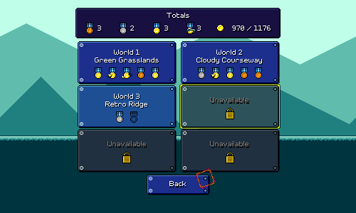
I actually already knew how to do that: just go back to the medal system that I used to have before:
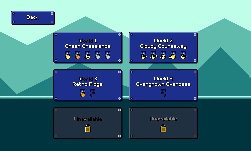
I originally tossed out the medal graphics because they were redundant with coin counts. By looking at the old level select screen, you could already tell how well you did on each level and which ones were cleared perfectly by looking at the coin numbers, so there was no point in also having medals.
Now, however, I wanted some way of showing the status of each level in a world in a compact way (e.g. not showing 5 different coin counts crammed into the same space). I'm using the medals as visual iconography for this.
Since the medals are now indicative of coin counts (and not just whether you cleared a level / perfectly cleared a level), I added bronze and silver medals. So, now you get a bronze medal for any type of clear, a silver for getting at least 33% of the coins, a gold for at least 66% of coins, and a gold medal with an orbiting star for getting every single coin in the level. These thresholds are a bit arbitrary for now -- nothing about the coin amounts have been tuned, really -- but for now they'll do just fine.
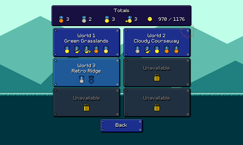
I thought it would be nice to add some sort of total count for medals and coins, so I managed to fit that into this screen, as well as move the back button to the bottom:
And with all that, we finally have our new and revised flow all working:
(Notice also that I tweaked the look of the left and right buttons slightly -- they pulse and are less decorative, to hint that they function differently and can't be "selected" via keyboard)
It took a lot of iteration, refactoring and reimplementation (more that you might imagine) to get this all working properly, but it's all looking great now and I'm glad I put in the work! This is the kind of refactor/revamp that really couldn't have been gotten right from the beginning, I don't think...at the time when I first designed the level selection UI, I didn't even have different backdrops for each level yet!
Demo Promo Screen
One other thing I threw together is a little promo screen to put into the demo version of the game:
The idea being that this can get shown whenever you reach the end of the demo, or click on a level or feature that's not available. Clicking on the button opens up a browser window or tab taking you to the game website. This kind of thing harkens back to old PC shareware demos...does anybody even remember those...?
Switch Port
Just a quick update on the Nintendo Switch port of Rhythm Quest -- so far it's going pretty well! I haven't reimplemented save/load functionality (currently disabled), I still have to do a new controls tutorial, and there's other stuff about input handling to rework, but the actual game itself is running great! You can see a little bit of an FPS drop when you transition between different levels in the menu (lots of full-screen layers with transparency all drawn at the same time), which I might have to look at (maybe using an alpha test shader?), but otherwise it's going pretty well so far. I've already done some preliminary easy performance optimizations and load time optimizations which seemed to have help things along.
Things are going to be a bit quiet for Rhythm Quest in the coming month, as I've got Ludum Dare coming up to prepare for and participate in, and another trip out of state as well. But I imagine I'll still probably be fitting in some progress here and there when I can.
<< Back: Devlog 28 - WebGL Port, Checkpoint Graphics
>> Next: Devlog 30 - Enemy Character, More Odds and Ends