Devlog 21 - Level Graphics Revamp
Published: January 14th, 2022
Screenshot time! I'm back from a long break over the holidays, and I've been doing a ton of work on level graphics for this first week back in action. I've got a lot of juicy gifs to show off as a result!
I mentioned in a previous devlog that I had revamped the rendering of the level graphics to use a new palette shader. I've been working on other things, so that has actually gone mostly unutilized until now (more accurately, it made most of the levels graphically broken...), but I finally jumped in and started working out the color palettes for each existing level. I've also been meaning to draw unique backdrops for each level as well as come up with some different particle effects for accentuating chorus sections. Here's a showcase of what I have going on so far.
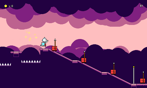
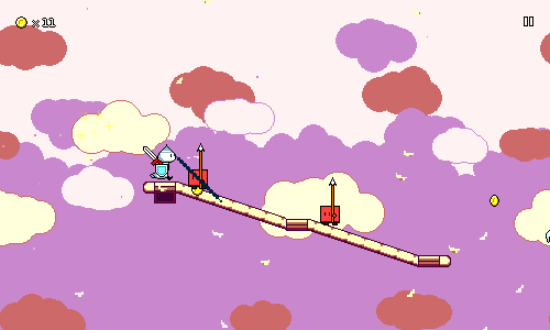
Here's level 1-2 in action. You'll notice that most of the background graphics throughout are very simple, using large brushes, simple shapes and not a lot of detail (these "clouds" are just large blobs drawn with a circle brush). This is mostly because it happens to be way easier for me to do, but it also serves well functionally as to not distract from the foreground as much.
I've been learning a lot this week about how to effectively utilize the color palettes to highlight different points in the music. Here, the colors shift to become more vibrant (saturated) and brighter here at the chorus checkpoint, but something else you may not notice at first is that the number of colors also increases. Before the chorus, the background and foreground both share the same 4-color palette, but at the high point of the song, the background and foreground each get their own separate palette, for a total of 8 colors. This helps bring an extra level of visual interest to the scene at that moment, so I've been using this as a consistent pattern throughout all of the levels.
As an aside, the main reason I wanted to implement the palette shader by using a lookup texture (as opposed to simply inputting numeric color values) was that I really wanted to be able to edit my palettes visually rather than by typing in numbers. Here's the palette for level 2-3, as an example of what I've been working with:
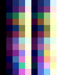
The leftmost 1 column and rightmost 2 columns are currently reserved for black and white, but other than that, you can see on the left half the 4 colors used for the foreground, and on the right side the 4 colors used for the background. You'll notice that these are the same until the bottom part of the texture, which corresponds to the chorus -- this is where the two palettes diverge and we get 8 different colors. Being able to edit my palettes like this not only lets me use my handy-dandy HSV color picker, but also serves as a nice "color graph" of the level at a glance.
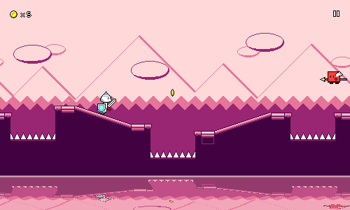
Level 1-3 doesn't really have anything too special going on, aside from the special water shader, which I added in ages ago. A lot of these backgrounds are inspired by Game Boy games -- which, of course, also make use of a 4-color palette. I actually ended up going with less saturated colors in the background for the chorus here, which leads to the foreground being more in focus. Perhaps the oppposite of what you might expect, but I think it still works out.
The backgrounds in level 1-4 are also inspired by some backdrops from a Game Boy game (Kirby's Dream Land 2). I had to do a bit of experimenting to come up with a texture for the "trees" that looked right but wasn't too visually distracting.
Again, notice that the color set used for the foreground is slightly different than the background (especially the yellow highlights). Of course, all 8 colors still need to work cohesively with each other. It's definitely been an interesting discovery process playing around with the freedom of using 8 colors. There's also a surprising amount that I can play around with for how to distribute the 4 colors across the different backdrop layers -- I remember having to play around with that a bit to get it looking right. I think the parallax scrolling effect really stands out in this particular level due to the complex layering.
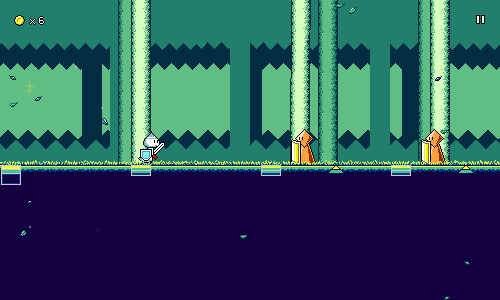
Here's level 2-1. I should mention here that each world now has its own tileset for the ground / ramps / jumps! I decided to see how world 2 would look with no "solid" fill for the ground, and was pretty much sold on that instantly, as it really helps to fit the "cloud/flying" aesthetic of the world.
Something else that I discovered while working on this level was that I could have a little bit of vertical parallax scrolling in addition to the horizontal scrolling. You might notice it if you watch how the vertical positions of the cloud layers shift relative to each other. I think this helped add another layer of depth to the otherwise-simple background. I also really like how the "falling petals" particles turned out here.
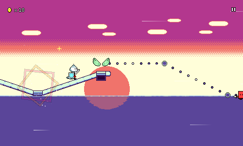
Level 2-2's background is perhaps a bit simplistic, but the cool part here is how the edge of the water has this shimmering effect. There's no lighting or anything going on here, it's literally just two different patterns of coloration that scroll at different rates and then blend together. This is an age-old trick that I used way back in Ripple Runner. Unfortunately the reflection of the sun on the water is static right now, but maybe that'll change later?
I've had to keep readability in mind while designing all of these backdrops. Notice that the central horizontal band (where most of the gameplay elements are) is pretty plain here. It also helps to keep most of the primary background colors desaturated, as that lets the foreground stand out more. I wrote a blog post a while back giving some examples of how background saturation can really affect scene readability, so it's important to check and tone down if necessary.
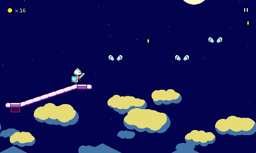
Level 2-3 is focused on combinations of air jumps and flying, so as the level progresses you go up and up. This created a really cool opportunity for me to create a level backdrop that slowly scrolls vertically over time as you go through the level, starting with a nighttime cityscape, going up through the clouds, and ending with a starry sky.
There's this fantastic moment where the moon scrolls into view right as you enter the chorus and I'm really proud of how this ends up working. It almost seems like I designed the music and gameplay around this concept, but really it was the other way around, haha. If you look closely, you'll see some of the stars shimmering in and out of view -- this is the particle effect for this level! It's very subdued, but the other things I tried detracted from the main focus of the moon in the starry sky, so this is what I went with instead.
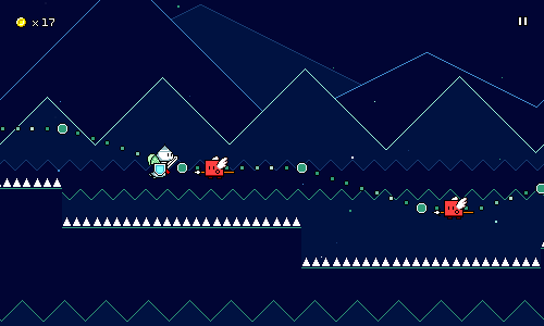
World 3 is the "retro" world, so for level 3-1 I'm trying to evoke old game console imagery with the simple shapes and bright outlines against dark colors. I'm also starting to experiment with having some of the backdrop layers dip into the 4-color foreground palette, which again serves to increase the level of visual interest at the chorus point.
The particle effect here is dead simple, just some dots flying through the air. This is a callout to games like Mega Man 2 which used this "starfield" effect. There's actually two different particle systems running here: one is used for larger dots in the foreground, and the other one handles smaller ones in the back which travel less quickly. Just another way to add the illusion of depth to the 2D scene!
That's all I've got for now! It's only been a week but the game is looking wayyy better now thanks to all the visual work. Things like this are always super satisfying to work on since you can really see/feel the game coming to life as you add them in. I'm almost done working through the graphics for all of the existing levels, so after that I'll probably move onto something else like more character animations.
I'd like to re-emphasize how simple the actual spritework is in all of these backdrops (the last one is literally just a bunch of triangles/zigzag lines...). Most of the appeal comes from good use of layering, as well as careful color selection. Perhaps this can serve as a bit of inspiration to anyone who thinks that they can't make something look good because they're not confident with their artwork. Sometimes, keeping it simple is more than enough!
<< Back: Devlog 20 - Speed Zones
>> Next: Devlog 22 - Character Animations