Devlog 22 - Character Animations
Published: January 21th, 2022
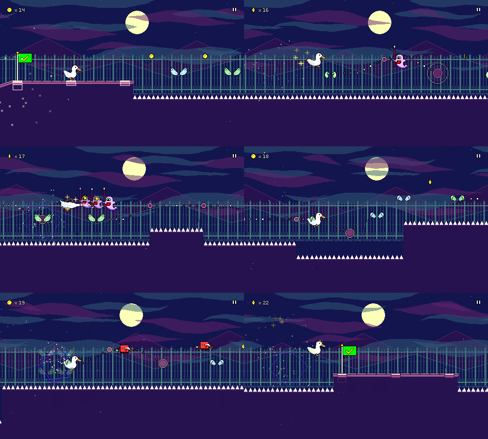
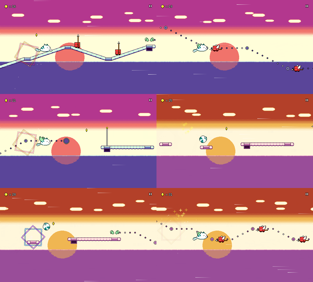
This week I did the backdrops and palettes for level 3-2, took care of some bugfixes, and also worked on some character animations!
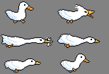
I've finished the animations for ducky:
And you can also now play as Furball!
I thought it might be fun to look at some of these animations in a little more detail. I'm by no means very experienced with animation, but maybe it'll be somewhat illustrative to look at anyways.
Ducky
Having recently had pet Pekin ducks in my life, I had a lot of reference photos and videos on hand to look at when drawing ducky...
The proportions aren't entirely accurate to life, though -- I went with more of a chibi-styled look where the head is drawn a bit larger, otherwise it wouldn't really show nicely in a sprite of this size. With pixel art it often helps to first decide how the smallest important features -- the eyes -- are going to be drawn, since at this size, even one pixel can change the way it reads entirely.
For the run cycle, I really wanted to accentuate two things -- the characteristic head-bobbing of bird movement, and the side-to-side duck waddle motion. This is where thinking about body physics/kinesthetics can help (or just referencing videos). For example, ducky's head goes forward when taking a step, to help maintain the right center of balance. There's some sub-pixel motion involved here, especially with the front of ducky's belly.
The shading in the feathers is fairly light here and was only put in after I tested the main silhouette and liked how it looked in motion. I did this by deciding on a few main "lines" to follow to indicate shading of the feathers, then essentially drew those freehand over each frame. A little bit of inconsistency is actually important here to portray motion, otherwise it just looks like a weird decal shape that's shifting around.
I wanted to have minimal wind-up / anticipation frames for the attack animations, since it's important that they feel very responsive (in-game, the enemy actually gets hit immediately, without waiting for the animation to reach the "attack" point). So there's actually only a single "in-between" frame here between the normal running pose and the fully extended attacking pose. Because of this, I'm using smearing on that frame in order to convey the path of the attack motion better.
For pretty much all of the attack animations, it looks way better if some sort of full body motion is involved to give some sense of weight to the attack. Here, ducky lunges with their whole body, and I'm using a sort of elastic stretch to enhance the impact.
Ducky's jump animation is the same as the run animation, but without the head bobbing. This is played twice as fast as the running animation, which is really cute; it looks like ducky is paddling their feet in the air, which is actually what can happen if you lift a ducky up in real life...
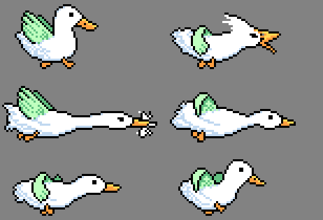
The flying animation is just the same thing, with the wings overlaid. Although I'm reusing the same green wing graphic, I can't just overlay a shared wing animation on top of each character, because I need to manually position and adjust the wings to line up with wherever makes sense on the character.
This is doubly true for the flying attack animation. Notice how the wings move along with the rest of the body as ducky stretches horizontally. I'm also choosing specific frames of the wing animation to match with the attack animation frames instead of just letting it play out independently.
Furball
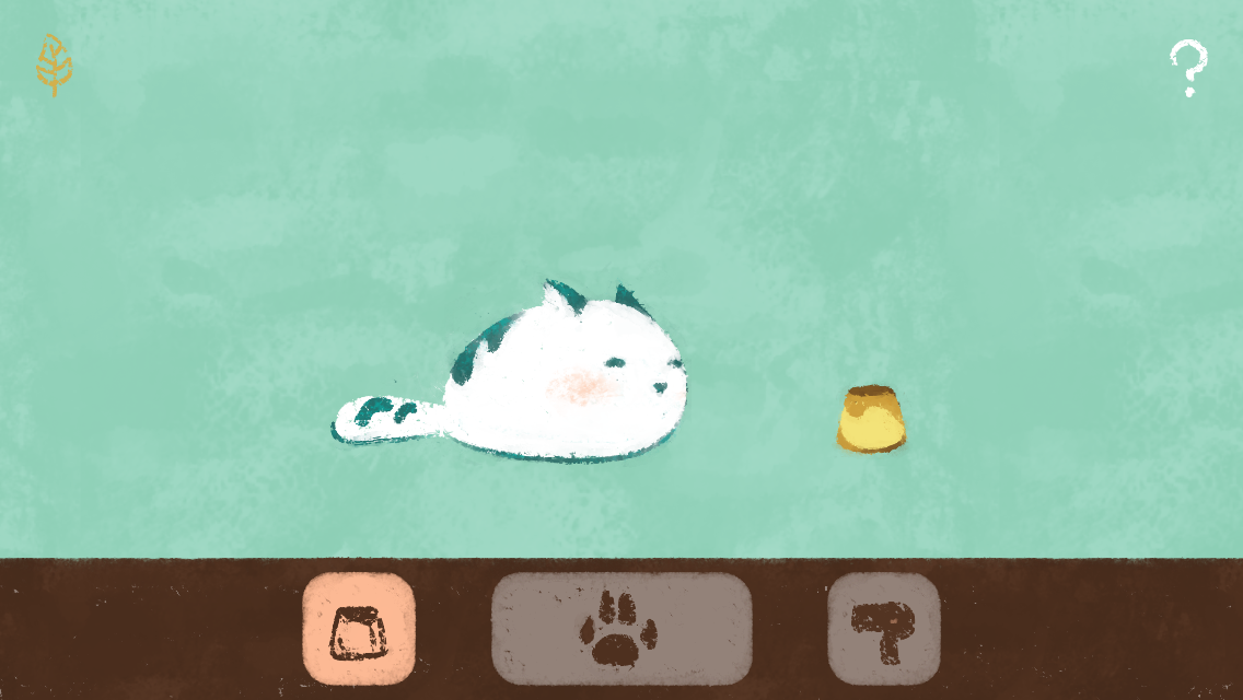
Furball was originally drawn by my friend for Pet Furball and Hyper Furball:
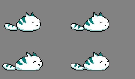
Building the run animation was mostly a matter of just translating that to pixels, but I also had to figure out how to get the stretch and squash to look natural, which involves some subpixel shenanigans. It's tempting to just drag an entire rectangle of pixels and then shift it, and that's indeed what I did to start, but you have to manually adjust things from there otherwise it just looks very weird.
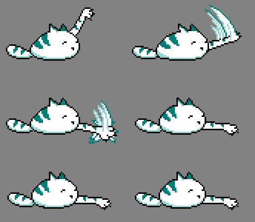
My first attempt at Furball's attacking animation really fell flat:
I drew this one based on the graphics from Hyper Furball, but as soon as I put it in the game it was obvious that it lacked the right sort of movement and follow-through. Here's the newer one:
I didn't do as great of a job of it as I did with ducky's animation, but again notice the attempt to introduce some body movement, both with the little hop, and with the body turning slightly from left to right. Really big smear arcs work well for quick slashing motions like this, I think; you see it all the time in other games for sword slashes. It's important that the smears have some contrasting colors (dark blue against white, in this case), otherwise they can fail to show up against certain backgrounds.
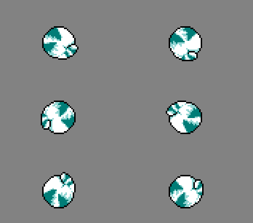
Furball's jump animation is really fun as it's a spinning somersault jump. This is actually just two unique frames, which I then copied and rotated in increments of 90 degree angles to form the rest of the frames. You might be asking why I didn't just use one frame and rotate it in increments of 45 degrees, and that's because pixel art genrally doesn't rotate cleanly across those angles.
When tweaking these frames I learned that since they go by so quickly, I needed to de-emphasize smaller details since they could just lead to weird-looking afterimages when the animation is played at full-speed. I tried to lighten some of the lines around Furball's tail and smear out the body fur patterns a bit more as a result.
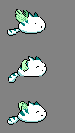
I originally tried having Furball's flying animation be the same as his walk/run animation, but that ended up looking really weird, as the sretch/squash didn't make sense and his tail just sort of floated horizontally in the air awkwardly. The new version tries to have the motion work together with the wing flaps a little better.
That's it for this week! I may try to work on one or two more additional characters next week, so stay tuned for more updates!
<< Back: Devlog 21 - Level Graphics Revamp
>> Next: Devlog 23 - Samurai Shaver
